This week, we will use the NSW Crime dataset. This workshop introduces 1) how to compute correlation coefficients and 2) how to create scatterplots.
Correlations
Suppose that we want to examine the relationship between two continuous variables such as whether and how robbery rates are correlated with unemployment rates. Computing correlation coefficients is an easy way for this task.
To create a correlation table, go to Analyze>Correlate> Bivariate (see <Figure 1>) .
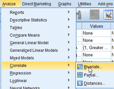
Figure 1: <Figure 1>
In the box of Bivariate Correlations, 1) move all the variables of your interest (in this case, robbery and unemploy) to the box of Variables:. And then 2) Choose Pearson in the section of Correlation Coefficients. 3) You can show asterisks (*) in your output to highlight a statistically significant correlation coefficient by checking the box “Flag significant correlations” (see <Figure 2>). 4) click OK.
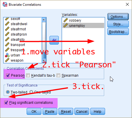
Figure 2: <Figure 2>
<Figure 3> shows the output of correlation. You may notice different numbers of cases across cells. Correlations are calculated based on all the cases which have valid values on both of two variables, which means that cases with missing values on any of the two variables are excluded from the analysis. In <Figure 3>, Pearson’s r is .386, and its associated p-value is less than .001., which suggests that robbery and unemployment rates are moderately correlated, and this association is statistically significant at .05.
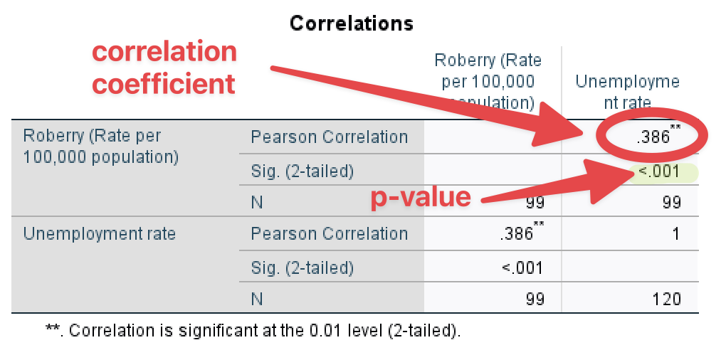
Figure 3: <Figure 3>
You can compute correlation coefficients for multiple (more than two) variables. Think about other variables that may be correlated with robbery and unemployment such as percentage of residents who rent dwelling (pctrent), income inequality measured by Gini coefficient (giniinc), median house prices (housmedprice), and median age of residents (medage). You can simply add all the variables of your interest to the list of Variables (see <Figure 4>).
Note: Gini coefficient measures the level of economic inequality. It ranges from 0 (perfect equality) to 1 (perfect inequality). An LGA in which every resident has the same income would have an income Gini coefficient of 0, which indicates perfect equality. An LGA in which one resident earns all the income, while all the others earn nothing, would have an income Gini coefficient of 1, which indicates perfect inequality. Thus, higher Gini coefficients of income mean higher levels of income inequality.
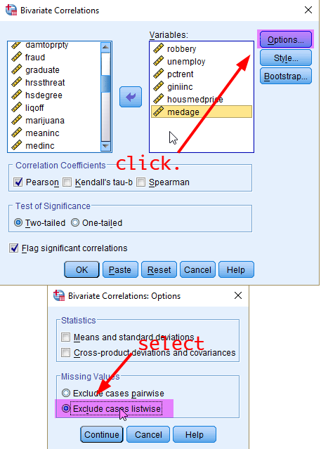
Figure 4: <Figure 4>
When you compute correlation coefficients between more than two variables, the way to deal with missing values can make a big difference in your output. The “pairwise deletion” takes into account cases in which valid values are available for each pair of variables. For example, the correlation coefficient between robbery and unemployment rates is computed using cases which have valid values in both variables. On the other hand, the correlation coefficient between robbery rates and the median house price is computed using cases which have valid values in these two variables. Therefore, each correlation coefficient can be computed based upon different sets of cases, which makes it difficult to compare correlation coefficients directly.
The “listwise deletion” method can fix this problem. It computes the correlation coefficient across selected variables using the same set of cases which drops any cases that have missing values on any of the selected variables. However, a disadvantage with the use of listwise deletion is that you may lose more cases compared to the use of pairwise deletion. In this workshop, we will use “listwise deletion” because it is a preferred method in most social science research. 1) Click Options, 2) tick “Exclude cases listwise” and then 3) press Continue (see <Figure 4>). Then, in the previous box, click OK at the bottom.
You will see the correlation matrix as in <Figure 5>. Which shows correlation coefficients across all the variables of your choice. Each cell shows a Pearson correlation coefficient and its p-value between the corresponding column and row variable. For instance, the correlation coefficient between robbery and unemployment rates is .354, and its p-value is less than .001.
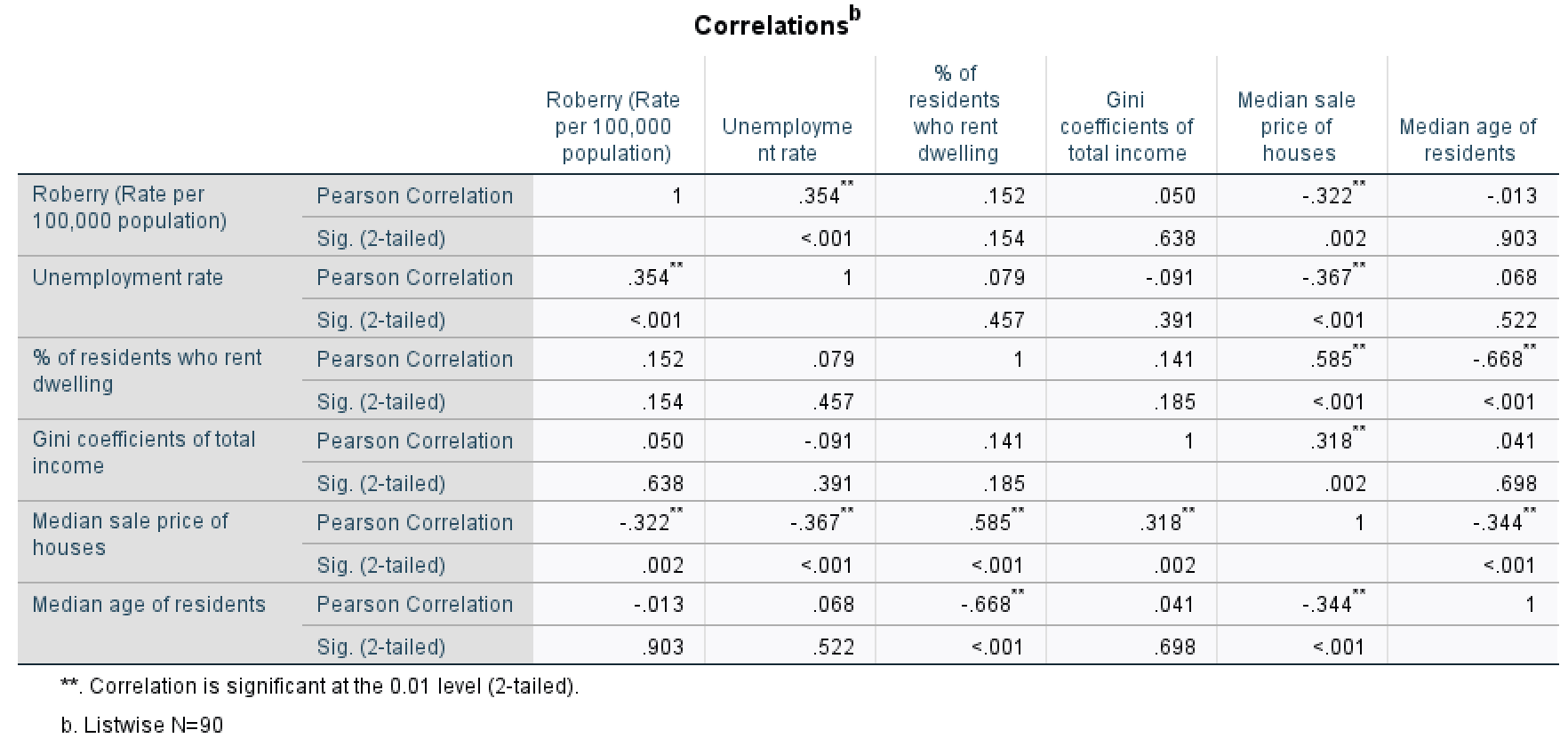
Figure 5: <Figure 5>
Scatterplots
Scatterplots are an effective visualisation to examine bivariate relationships. To create a scatterplot, go to Graphs > Legacy Dialogs > Scatter/Dot (see <Figure 6>).

Figure 6: <Figure 6>
First, we will make a scatterplot between two variables (robbery and unemploy). Select “Simple Scatter” in the box of Scatter/Dot and click Define(see <Figure 7>).
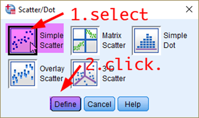
Figure 7: <Figure 7>
In the box of Simple Scatterplot, 1) move your dependent variable (robbery) to the section of Y Axis, 2) independent variable (unemploy) to the section of X Axis, and 3) click OK.

Figure 8: <Figure 8>
Then, you will see the scatterplot between robbery and unemploy as in <Figure 9>.
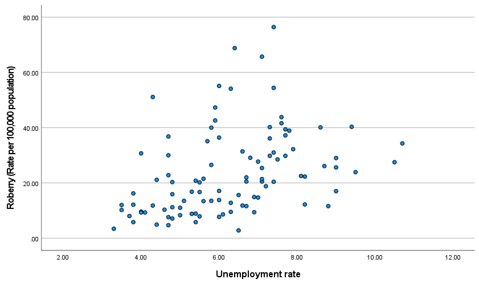
Figure 9: <Figure 9>
Also, you can create scatterplots across many variables so that you can examine bivariate relationships across them. To make scatterplots across multiple variables, choose “Matrix Scatter” in the box of Scatter/Dot (see <Figure 10>), and put all the variables of your interest (robbery, unemploy, pctrent, giniinc, housmedprice, medage) in the section of Matrix Variables (see <Figure 11>). It will generate a matrix of scatterplots as in <Figure 12>. If you look at <Figure 12>, the scatterplots are too small to identify the relationship. So, it is necessary to increase the plot size. Right-click on any area of <Figure 12>, and then click Edit.
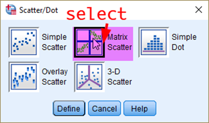
Figure 10: <Figure 10>
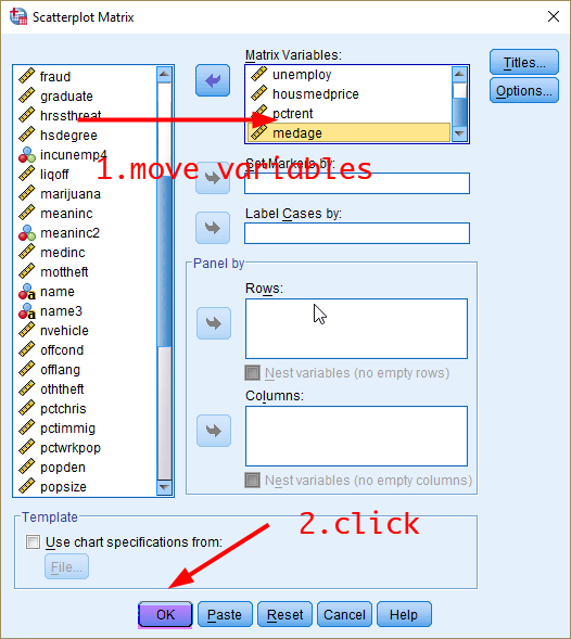
Figure 11: <Figure 11>
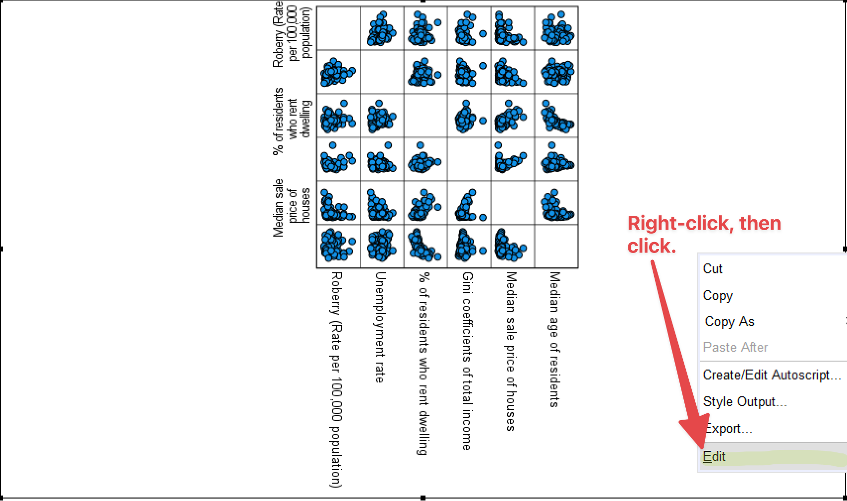
Figure 12: <Figure 12>
In the newly-poped-up window of Properties (See <Figure 13>), increase the height. Then, the width is automatically adjusted to the increased height. In <Figure 13>, I increased it to 600. Click Apply. Then, check the figure size. If you are satisfied, click Close.
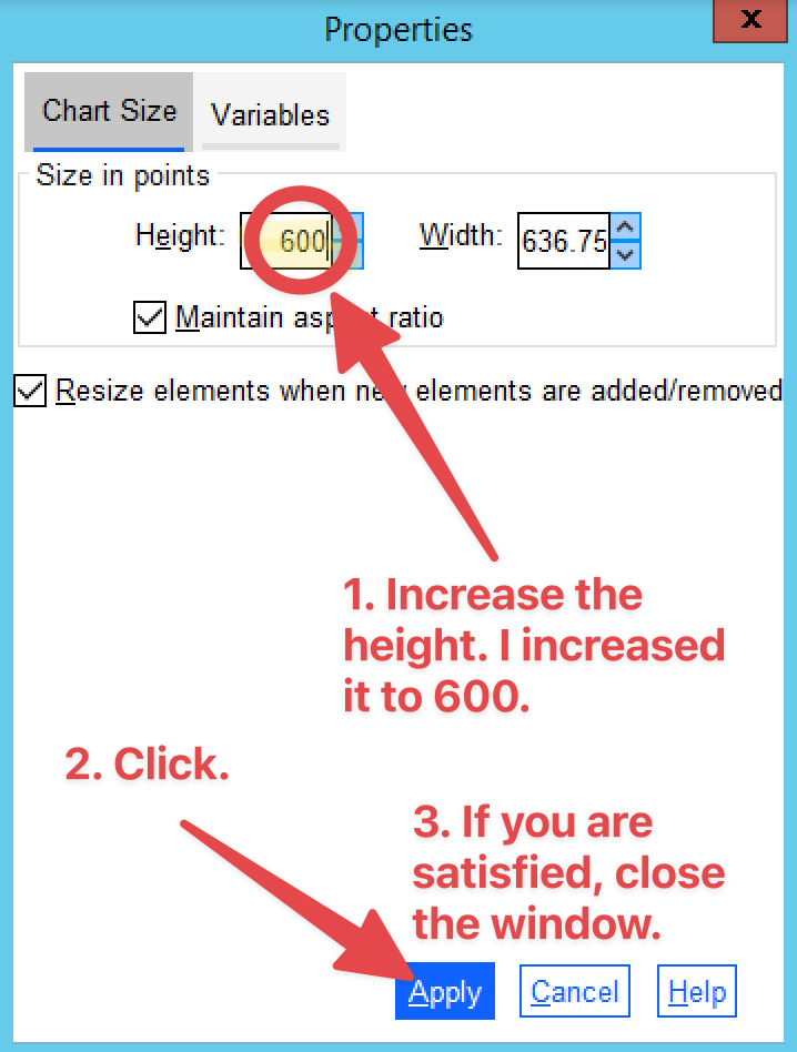
Figure 13: <Figure 13>
Then, close Chart Editor (See <Figure 14>).
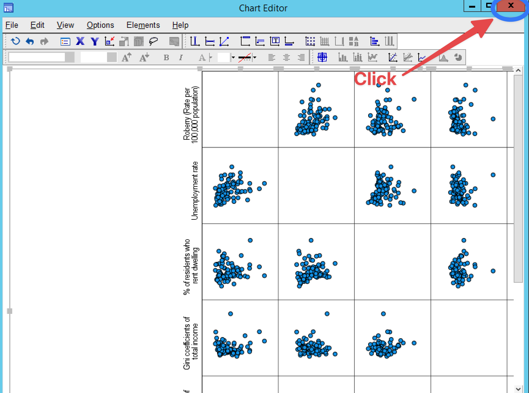
Figure 14: <Figure 14>
The final figure looks like <Figure 15>.
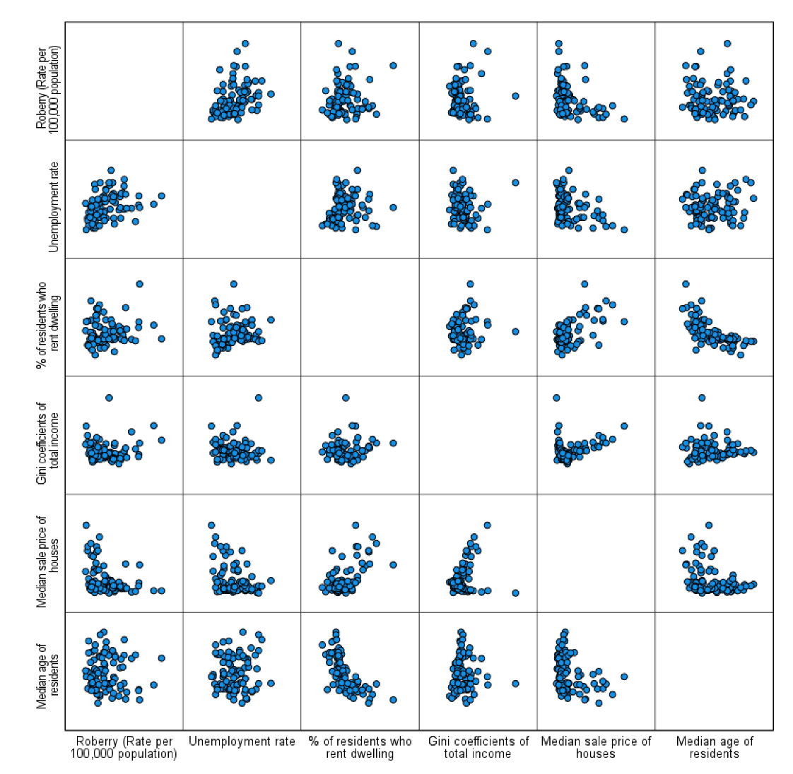
Figure 15: <Figure 15>
Workshop Activity 10: Correlations |
|