Preparation: Opening a data file
In the first workshop, you constructed an SPSS dataset of 30 respondents. We continue working on this data file. Therefore, the first step is to open your data file in SPSS.
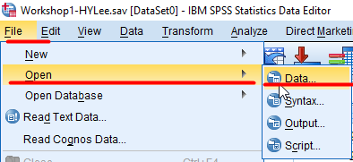
- To open a data file, go to File > Open > Data.
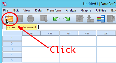
Or click the icon of OPEN at the top bar.
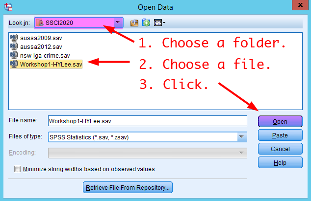
- In the window of Open Data, go to a folder in which your saved your data file in the workshop 1 (It is SSCI2020 folder. Google Drive >> My Drive >> SSCI2020) and choose your data file. Click Open.
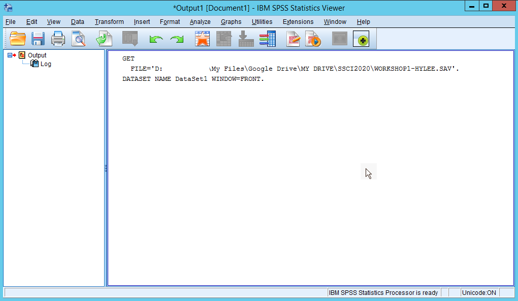
- You will see the Output window telling your dataset is loaded successfully. Minimise the Output window or come back to Data Editor using Switch Window icon in the navigation toolbar (See Swiwtch Windows). You will see your dataset loaded in Data View.
Making a frequency table.
Let’s make a frequency table of gender.
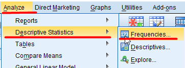
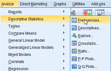
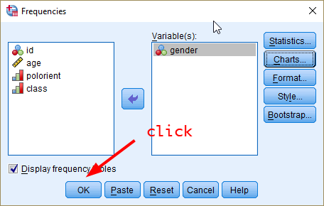
- Go to Analyze > Descriptive Statistics > Frequencies.
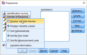
- In the box of Frequencies, right-click at the left variable pane. Choose Display Variable Names. Variable labels will be changed to variable names.
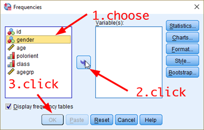
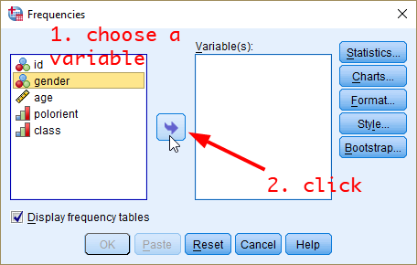
- Choose a variable you want to make a frequency table for (in this case, it is gender). And click the arrow in the middle. The variable will be moved to the right pane. Then, click OK at the bottom.
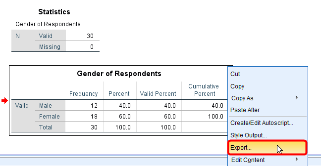
SPSS will open the Output window in which the frequency table is displayed. The week 3 lecture slide helps you to read this frequency table.
In the Output window, choose the table that you want to copy and then right-click. Select Export….
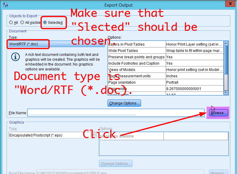
- In the box of Export Output, make sure that Objects to Export should be Selected and Document Type should be Word/RTF (*.doc).. Then, click Browse in the middle.
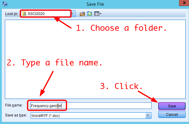
- In the box of Save File, choose the SSCI2020 folder in Look in and type file names. Click Save.
In the box of Export Output, click OK at the bottom.
Click My Files icon in the navigation toolbar.
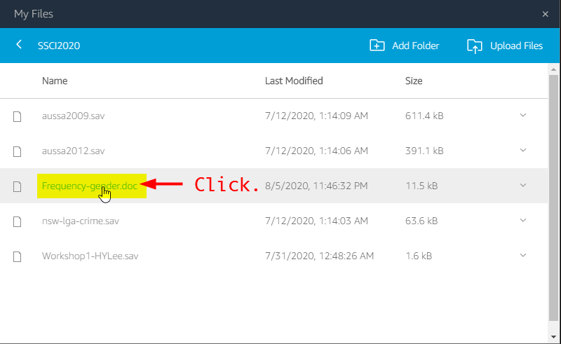
- Go to Google Drvie >> My Drive >> SSCI2020. Then, you will see “Frequency-gender.doc” file. Click “Frequency-gender.doc”. This file will be downloaded to your computer.
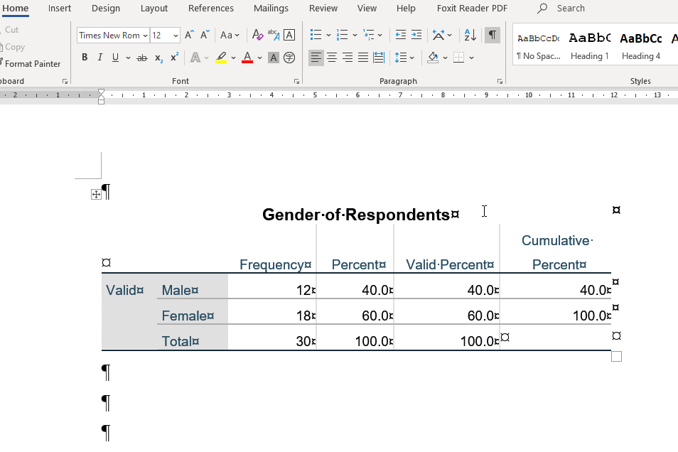
- Open the downloaded file in MS Word at your local computer. You will see the frequency table in MS Word. You can copy this table and paste it to any other documents (i.e. your final survey report).
|
Workshop 2 Participation Activity
|
- Make a frequency table of polorient. How many respondents define themselves as Right? Please report just the number.
- Make a frequency table of class. What percentage of respondents define themselves as Upper middle class? I recommend you to report a VALID percent. Please report just the number (e.g., If you get 15.6%, report 15.6). Do not include % in the answer.
|
Visualising data
The second task is to produce a number of useful graphics. Visualising variables provide an important “first look” of your data.
Producing a pie chart
A pie chart is a circular graph with slices that represent the proportion of the total contained within each category. Pie charts are preferred to visualise nominal as well as ordinal variables.
- To produce a pie chart, go to Analyze > Descriptive Statistics > Frequencies.
- In the popped-up box, you will see gender is already in the section of Variable(s) becuase SPSS remember what you did for making a frequency table. I recommend you to click Reset at the bottom when you start a new analysis. So, please click Reset at the bottom. Then you will see <Figure 15>. Select a variable for which you want to produce a pie chart and click the arrow in the middle. In this example, I will make a pie chart of gender.
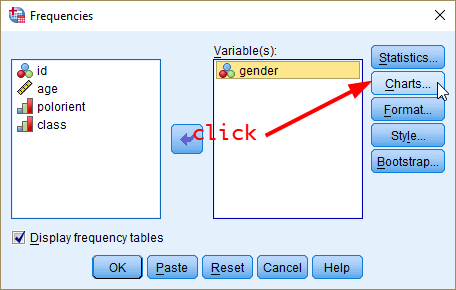
- Now, you will see the selected variable in the pane of Variable(s). Click Charts.
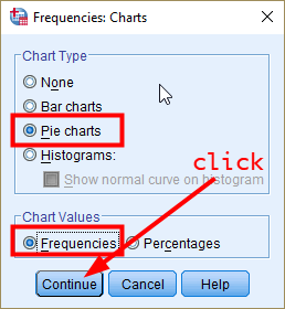
- In the popped-up box, select Pie charts in Chart Type and Frequencies in Chart Values. Click Continue.
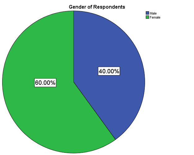
Note: If you select Percentages in Chart Values, the pie chart will show the percentage of each category of gender.
- You will be back to the previous Frequencies box. Click OK.
- In the output window, you will see the frequency table and pie chart of gender.
Note: The colour of slices in the pie chart could be different depending on the version of SPSS. But this difference does not affect the instruction of this workshop.
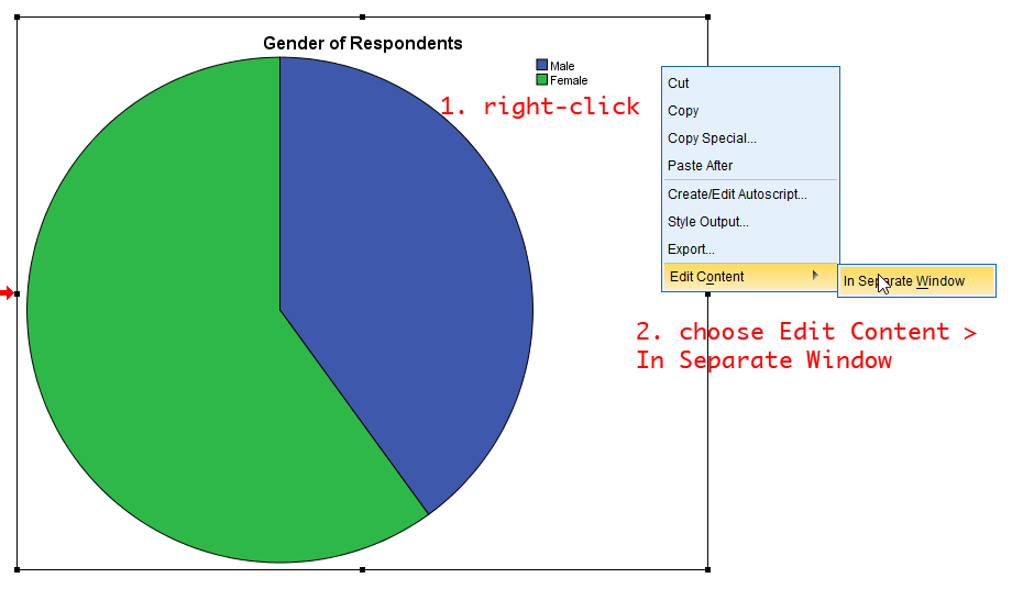
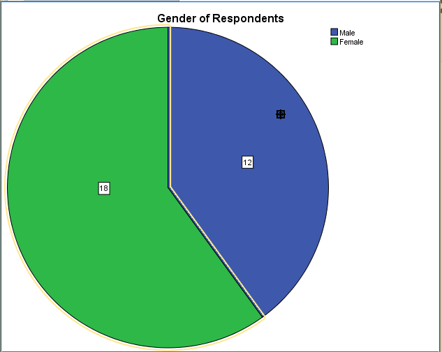
However, the pie chart you just produced does not provide information on the number (frequency) of males and females. Let’s add this information to the chart.
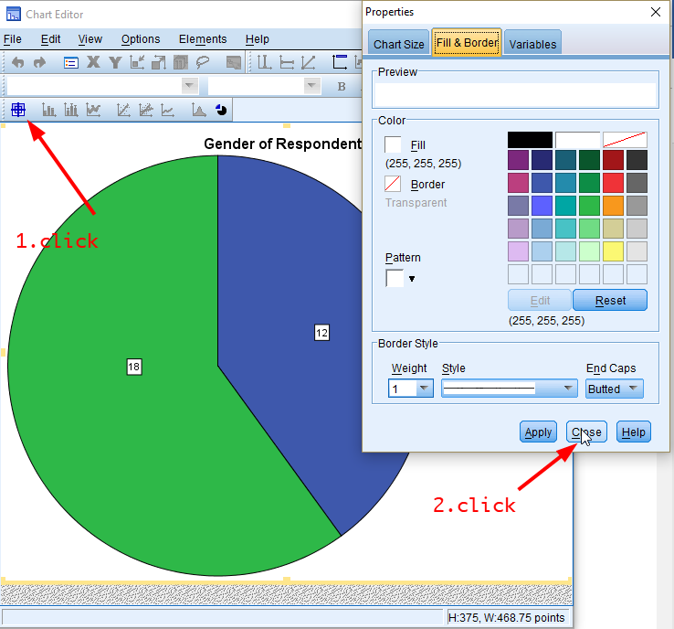
- At any place in the pie chart, right-click and choose Edit Content > In Separate Window.
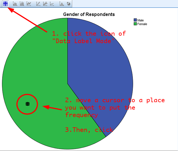
- In the popped-up window, click the icon of Data Label Mode (see the below figure). Move your mouse cursor to a place where you want to put the number and click. You need to click on both green (female) and blue (male) areas. Then, you will see the frequency of male and female category.
- Now, you will see the frequency of male and female category.
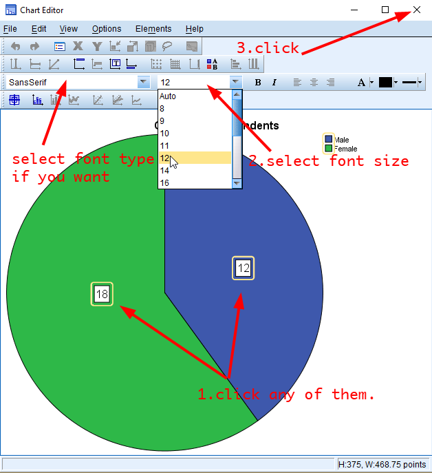
In the above figure, the size of numbers is too small. Let’s edit the font size for better readability.
- Click the icon of Data Label Mode again to go back to the edit mode. You will see a popped-up window of Properties. Click Close.
- Click any numbers (frequencies) in the pie chart. Choose font types and font sizes as you want. Then, close the window.
Producing a Bar Chart
A bar chart (also called a bar graph) is a graphical display of data using bars of different heights. Bar charts are preferred to visualise nominal or ordinal variables.
- Go to Analyze > Descriptive Statistics > Frequencies.
- In the box of Frequencies, click Reset at the bottom again. Choose a variable for which you want to produce a bar graph and click the arrow in the middle. In this example, we will make a bar graph of gender.
- Click Charts.
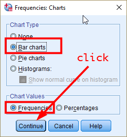
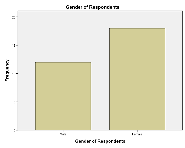
- In the box of Frequencies: Charts, select Bar charts in Chart Type and Frequencies in Chart Values. Click Continue.
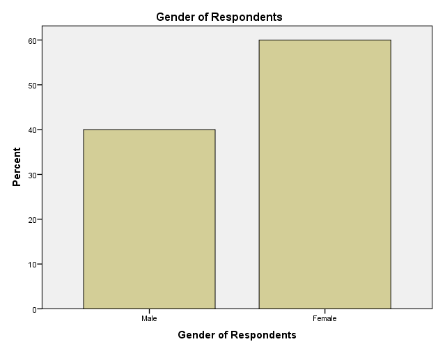
Note: If you select Percentages in Chart Values, the bar chart will show the percentage of each category of gender.
- You will be back to the previous Frequencies box. Click OK.
- In the Output window, you will see the frequency table and bar chart of gender.
You can edit the bar chart in the same way you did for the pie chart.
Producing a grouped bar chart
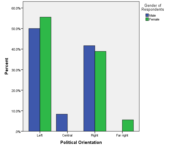
Suppose that you want to compare the frequency of a variable by subgroups. For example, you may be interested in investigating how the distribution of political orientation differs by gender.
A grouped bar graph produces bars for every combination of categories (gender X political orientation) and then groups those bars by subgroups (gender), typically using colored bars to represent a particular group. Therefore, a grouped bar graph provides an easy way to examine the relationship between two variables.
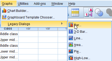
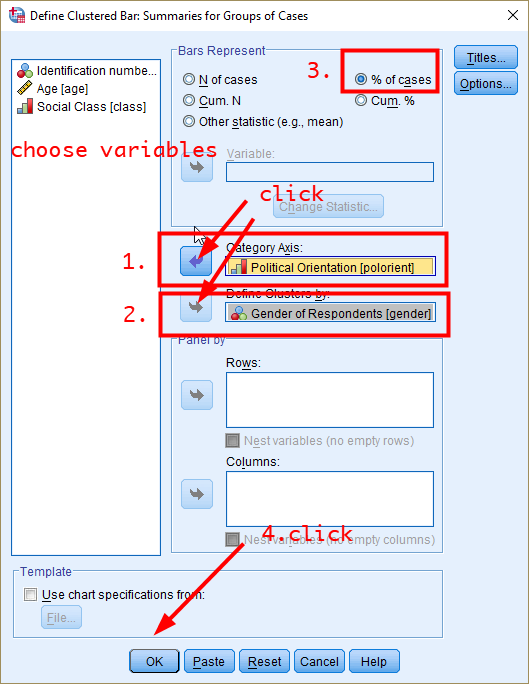
- To produce a grouped bar chart, go to Graphs > Legacy Dialogs > Bar.
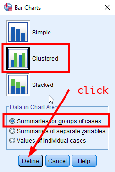
- In the box of Bar Charts, choose Clustered and Summaries for groups of cases in Data in Chart Are. Click Define.
- In the box of Define Clustered Bar: Summaries for Groups of Cases, 1) choose a variable for which a bar is produced (in our example, it is political orientation) in the pane of Variables, and click the arrow in Category Axis, 2) choose a group variable by which bars are compared (in our example, it is gender), and click the arrow in Define Clusters by, 3) choose % of cases in Bars Represent (comparing the percentages makes more sense because the number of males and females are different), and 4) click OK.
- In the Output window, you will see the grouped bar graph.
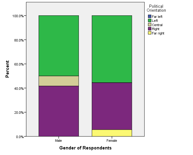
Producing a stacked bar chart
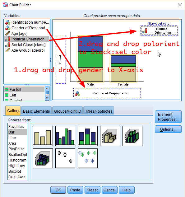
A stacked bar chart provides an alternative way to compare the frequency of a variable by subgroups. In a stacked bar chart, parts of the data are stacked: each bar displays a total amount, broken down into sub-amounts. Again, we compare the distribution of political orientation by gender.
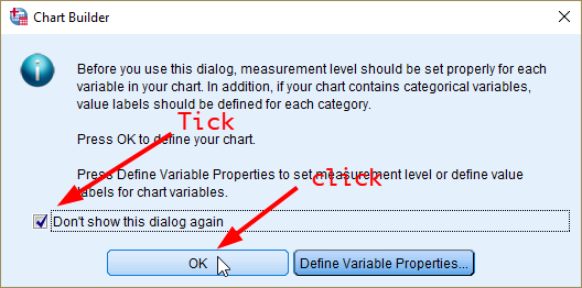
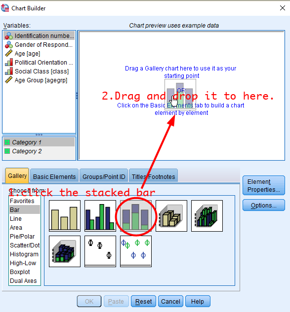
- To produce it, go to Graphs > Chart Builder.
- In the box of Chart Builder, tick the box of Don’t show this dialogue again and click OK.
- In the box of Chart Builder, click the icon of stacked bar chart. Drag and drop it to the upper white pane (see <Figure 38>).
- Drag and drop gender to X-axis and political orientation to Stack: set color.
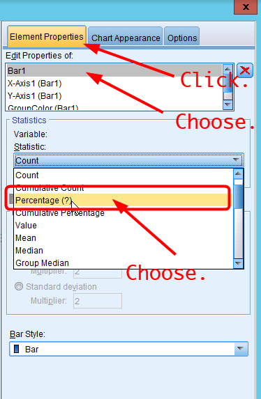
- In the pane of Element Properties, choose Bar1 in Edit Properties of: and Percentage(?) in Statistic.
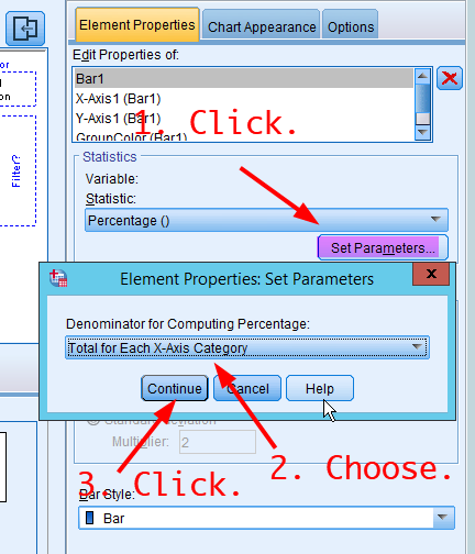
- Click Set Parameters in Statistics. In the box of Element Properties: Set Parameters, choose Total for Each X-Axis Category in Denominator for Computing Percentage:. Click Continue.
- Click OK at the bottom. You will see a stacked bar chart of political orientation by gender.
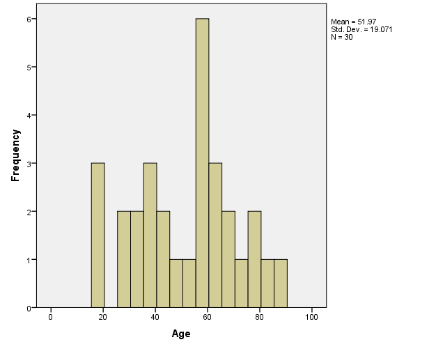
Producing a histogram
Histogram displays a graphic representation of the distribution of a single continuous variable. It is a kind of bar chart used for displaying continuous variables. The difference is that in a histogram, the bars touch with each other. The widths of the bars represent the widths of the intervals, and the height of each bar represents the frequency of each interval. In this example, we will make a histogram of age.
- To create it, go to Graphs > Legacy Dialogs > Histogram.
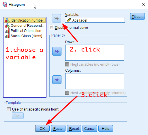
- In the box of Histogram, choose a variable you want to plot (in this case, it is age) and move it to a pane of Variable: by clicking the arrow next to Variable:. Click OK.
- You will see the histogram of age in the output window.
|
Workshop 2 Participation Activity
|
- Make a stacked bar chart of class by gender. Based on the stacked bar chart you created, which of the following is NOT true? (Tip: Adding the percentage to the chart would make the comparison easier. See the step 7 - 11 in Producing a pie chart)
(1) A higher percentage of lower class people is found in male respondents than in female respondents.
(2) A higher percentage of working class people is found in male respondents than in female respondents.
(3) A higher percentage of middle class people is found in male respondents than in female respondents.
(4) A higher percentage of upper middle class people is found in male respondents than in female respondents.
Note: You can find the link to the Workshop 2 Participation Activity on the iLearn (under the section of Week 3).
|
Last updated on 27 September, 2022 by Dr Hang Young Lee(hangyoung.lee@mq.edu.au)