This tutorial by Dr Hangyoung Lee, adapted to this website by Nicholas Harrigan and Ryan King.
Introduction
In this tutorial we cover techniques for drawing a number of useful graphics.
Visualising variables provide an important “first look” at your data.
The dataset used in this tutorial can be downloaded from here.
1. Producing a Pie Chart
A pie chart is a circular graph with slices that represent the proportion of the total contained within each category.
We can use pie charts to visualise nominal as well as ordinal variables.
To produce a pie chart, go to Analyze > Descriptive Statistics > Frequencies.
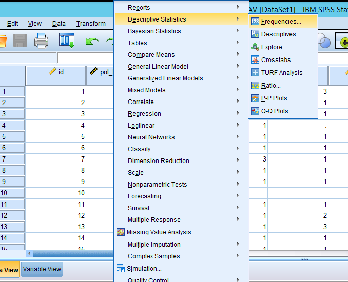
Figure 1: Analyze > Descriptive Statistics > Frequencies
In the popped-up box, select a variable for which you want to produce a pie chart and then click the arrow. In this example, I will produce a pie chart of gender (called female in this dataset).
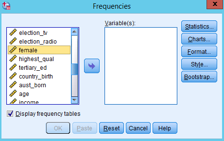
Figure 2: Select a variable for which you want to produce a pie chart
Now, you will see the selected variable in the pane of Variable(s). Click Charts.
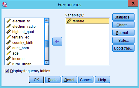
Figure 3: Click Charts
In the popped-up box, select “Pie charts” as Chart Type and “Frequencies” as Chart Values. Then click Continue.
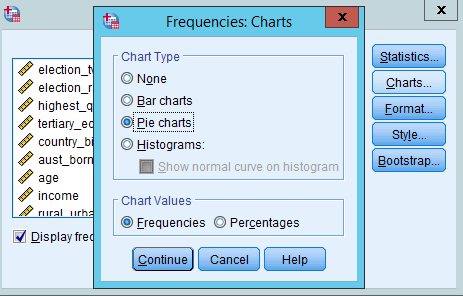
Figure 4: Select Pie charts as Chart Type and Frequencies as Chart Values
You will be back to the previous Frequencies box. Click OK.
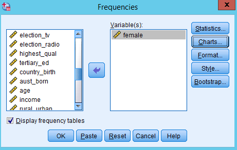
Figure 5: Click OK
In the output window, you will see the frequency table and pie chart of gender.
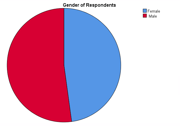
Figure 6: Pie chart of gender
However, this pie chart does not provide information on the number (frequency) of males and females. Let’s add this information to the chart. At any place in the pie chart, right-click and then choose Edit Content > In Separate Window.
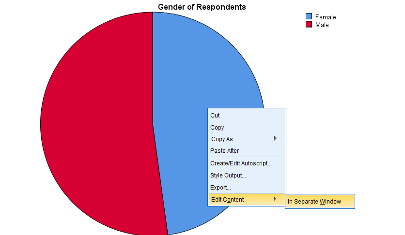
Figure 7: At any place in the pie chart, right-click and then choose Edit Content > In Separate Window.
In the popped-up window, click the icon of Data Label Mode (see Figure 8). Then, move your mouse cursor to a place where you want to put the number. And click. You need to click on both blue (female) and red (male) areas. Then, you will see the frequency of female and male category.
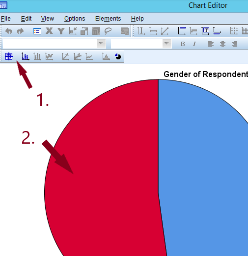
Figure 8: See the frequency of male and female category
In Figure 9, the size of numbers is too small. Let’s edit the font size for better readability. Click the icon of Data Label Mode again to turn off the data label mode and to go back to edit mode. You will see a popped-up window called properties. Close that.
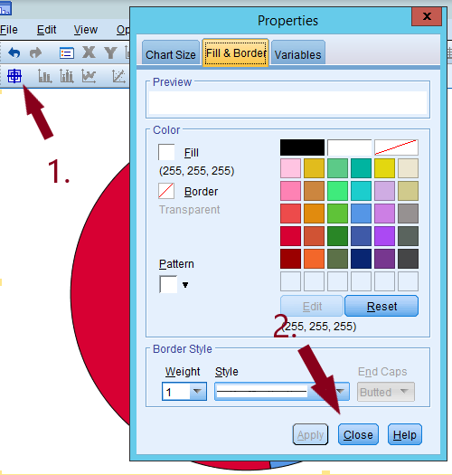
Figure 9: Click the icon of Data Label Mode again to turn off the data label mode and to go back to edit mode. You will see a popped-up window called properties. Close that.
Then, click any of the numbers (frequencies) on the pie chart. You will see the toolbar of font type and font size activated (see Figure 10). There you can change the size of font as well as the type. Let’s choose 12 as font size. Then close the Chart Editor by clicking X.
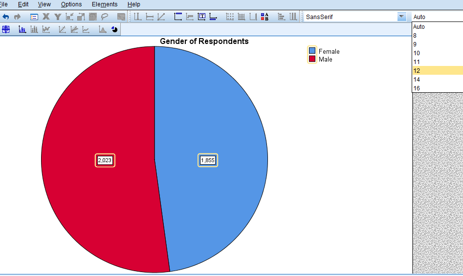
Figure 10: Click any of the numbers (frequencies) on the pie chart.
Note: In Figure 4, if you select “Percentages” as Chart Values (see Figure 11), the pie chart will show the percentage of each category of gender (see Figure 12).
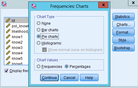
Figure 11: Select Percentages
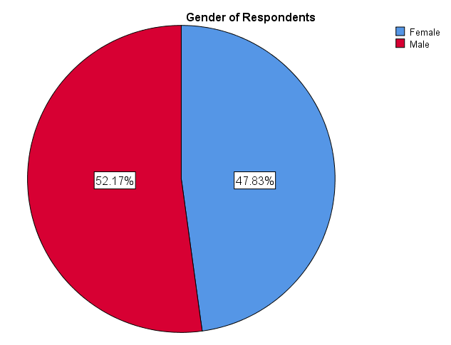
Figure 12: Notice how chart now shows percentage of each gender in your sample.
2. Producing a Bar Chart
A bar chart (also called bar graph) is a graphical display of data using bars of different heights. We can use bar charts to visualise nominal as well as ordinal variables.
2.1 Bar charts with y-axis as frequency
The Frequencies command will produce a bar chart as well. Go to Analyze > Descriptive Statistics > Frequencies.
Figure 13: Analyze > Descriptive Statistics > Frequencies
In the popped-up box, select a variable for which you want to produce a bar graph and then click the arrow. In this example, I will produce a bar graph of gender.
Figure 14: Select a variable for which you want to produce a bar graph and then click the arrow.
Now, you will see the selected variable in the pane of Variable(s). Click Charts.
Figure 15: Click Charts.
In the popped-up box, select “Bar charts” as Chart Type and “Frequencies” as Chart Values. Then click Continue.
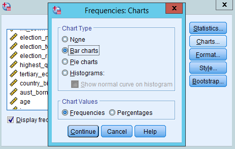
Figure 16: select Bar charts as Chart Type and Frequencies as Chart Values.
You will be back to the previous Frequencies box. Click OK.
Figure 17: Click OK.
In the output window, you will see the frequency table and bar chart of gender.
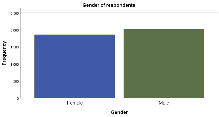
Figure 18: Bar chart of gender
The bar chart consists of a Y-axis, representing the frequency, and an X-axis, representing each category of gender.
2.2 Bar charts with y-axis as percentage
Sometimes it is useful to compare the percentages of each category in a bar chart instead of frequencies. Let’s make A bar chart with a Y-axis representing the percentage. Follow the same steps from Figure 1 to Figure 3. Then, select “Percentages” as Chart Values. Then, click Continue.
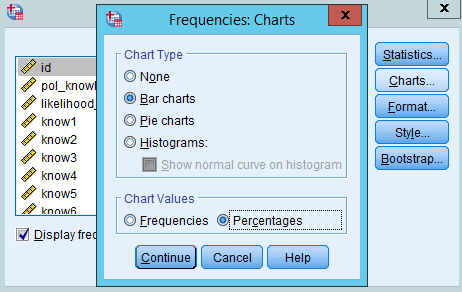
Figure 19: Then, select Percentages as Chart Values. Then, click Continue.
In the box of Frequencies, click OK (see Figure 15). You will see the bar chart with a Y-axis representing the frequency of each gender category.
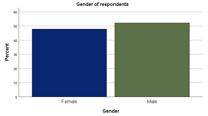
Figure 20: You will see the bar chart with a Y-axis representing the frequency of each gender category.
3. Producing a grouped bar chart
Suppose you want to compare the frequency of a variable by subgroups. For example, you may be interested in knowing how the distribution of political orientation differs by gender.
Bar charts can be used for this more complex comparison of data by grouping or stacking bar charts. Let’s examine grouped bar chart first.
A grouped bar graph produces bars for every combination of categories (gender X political orientation) and then group those bars by subgroups (gender), typically uing colored bars to represent a particular grouping.
To produce this grouped bar chart, go to Graphs>Legacy Dialogs > Bar.
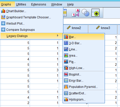
Figure 21: Graphs>Legacy Dialogs>Bar
In the popped-up window, choose “Clustered” as a type of bar charts and “Summaries for groups of cases” in Data in Chart Are. Then, click Define.
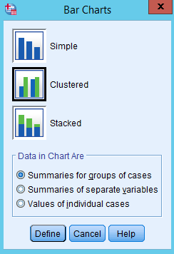
Figure 22: Choose Clustered as a type of bar charts.
In the popped-up window,
- choose a variable for which a bar is produced (in our example, it is highest qualification) in the pane of variables, and then click the arrow in Category Axis;
- choose a group variable by which bars are compared (in our example, it is gender called female here), and then click the arrow in Define Clusters by;
- choose “% of cases” in Bars Represent (comparing the percentages makes more sense because the number of males and females is different) and then the bars will represent the percentages (If you choose “N of cases”, the bar will represent the frequency);
- click OK.
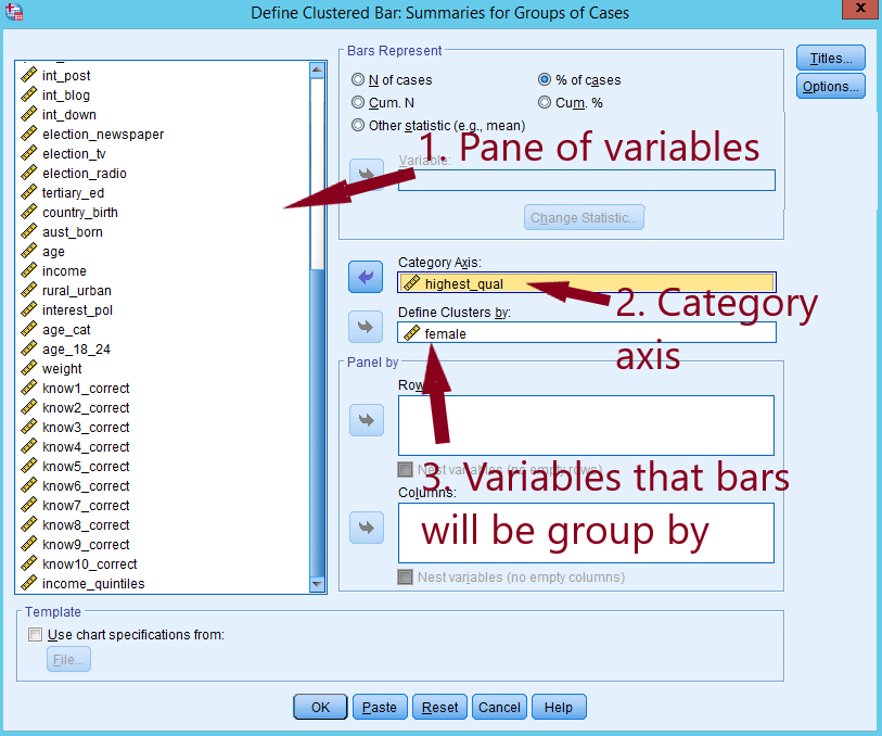
Figure 23: Choose a variable, and a grouping variable.
In the output window, you will see Figure 24.
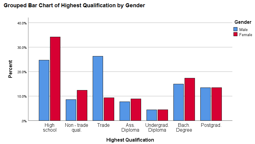
Figure 24: Grouped bar chart
You can add the percentages to this chart by following the same steps as you did for the pie chart.
4. Producing a stacked bar chart
A stacked bar chart provides an alternative way to compare the frequency of a variable by subgroups. In a stacked bar chart, parts of the data are stacked: each bar displays a total amount, broken down into sub-amounts. We will again compare the freqency of highest qualification by gender.
As the stacked bar chart requires categorical variables you must make sure that the variables you wish to use are labeled accordingly. To do this click on the variable tab on the bottom left of your screen:
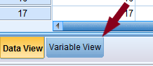
Figure 25: Variable tab
Here you will see a list of the variables in your data set. Under the ‘measure’ column you will see what each variable is classified as. I set the ‘female’ (AKA gender) and ‘highest_qual’ (AKA highest qualification) variables to nominal and ordinal respectively:
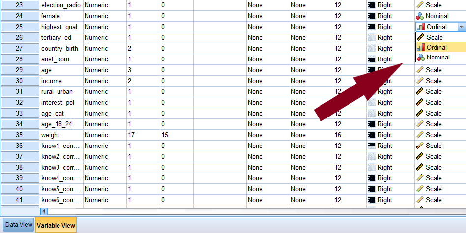
Figure 26: Graphs > Chart Builder.
Now, to produce the stacked bar char, go to Graphs > Chart Builder.
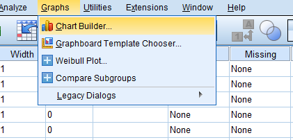
Figure 27: Graphs > Chart Builder.
In the popped-up window, tick the box of Don’t show this dialogue again and click OK.
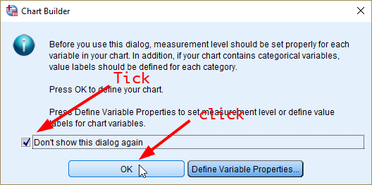
Figure 28: Tick the box of Don’t show this dialogue again.
In the window of Chart Builder, click the icon of stacked bar chart. Drag and drop it to the upper white pane (see Figure 28).
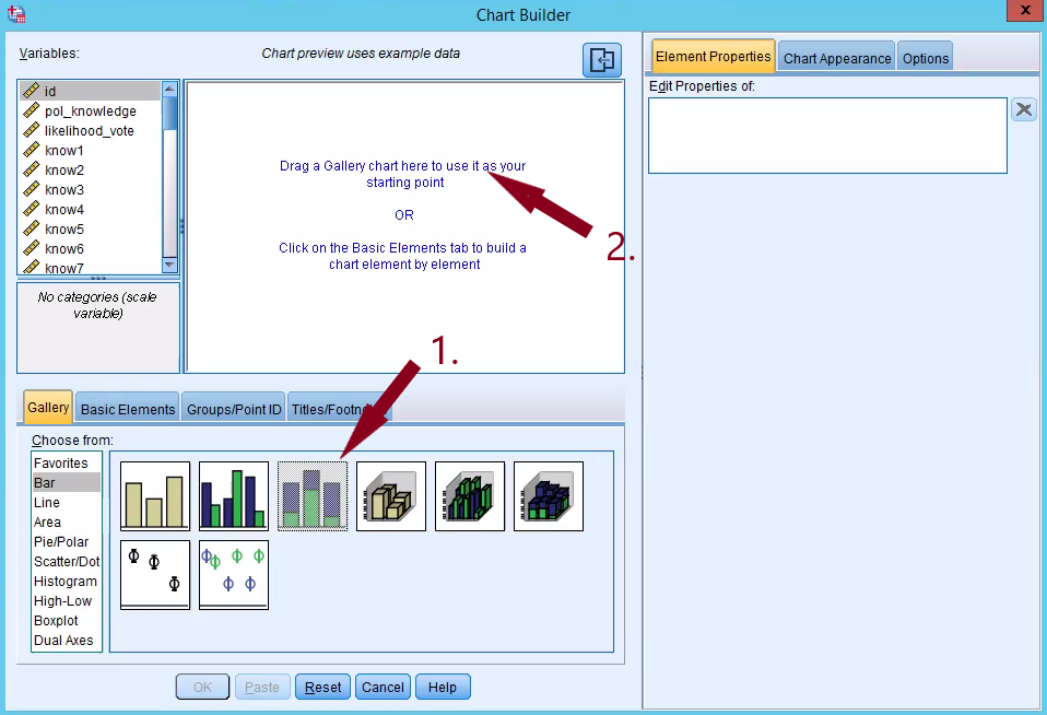
Figure 29: Drag and drop the icon of stacked bar chart.
Then, drag and drop ‘female’ to X-axis and ‘highest_qual’ to Stack: set color. After that, click Element Properties
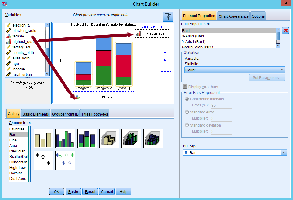
Figure 30: Drag and drop female to X-axis and highest_qual to Stack: set color.
Next, in the window of Element Properties, let’s edit properties of Bar1 by selecting “Percentage(?)” in Statistic.
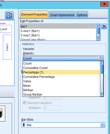
Figure 31: Select percentage in statistic
You will see Set Parameters activated (see Figure 31). Let’s open that box and select “Total for Each X-Axis Category” as Denominator for Computing Percentage. This is to calculate percentages within subgroups by choosing the total counts of subgroup as denominator (instead of the total counts of your sample, or grand total). This way, each group has 100% as total percentage so meaningful comparison can be made. Click Continue.
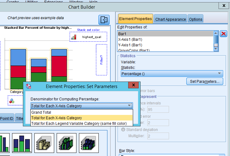
Figure 32: Choosing the correct denominator for computing percentage.
Lastly, click OK to finish the Chart Builder.
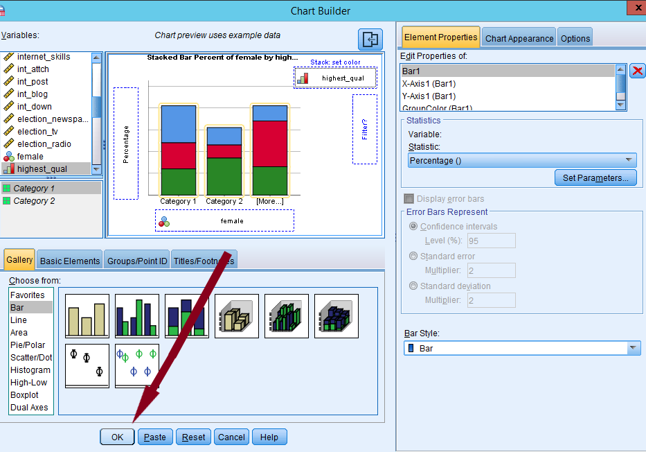
Figure 33: Click OK to finish with Chart Builder
In the output window, you should see a stacked bar chart of highest qualification by gender while both males and females have 100% as their total percentages. You may have to change the labels on the graph by right clicking and going to edit content > separate window.
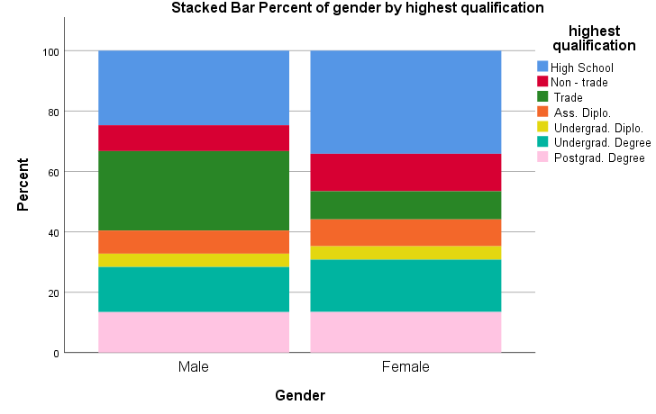
Figure 34: Stacked bar chart of highest qualification by gender
5. Producing a histogram
So far, we create graphs for categorical variables (nominal and ordinal). Can we visualise continuous variables? Yes, the histogram displays a graphic representation of the distribution of a single continuous variable. It is a kind of bar chart that can be used with continuous variables. The difference is that in a histogram, the bars touch with each other. The widths of the bars represent the widths of the intervals, and the height of each bar represents the frequency of each interval. We will produce a histogram of age. To create it, go to Graphs > Legacy Dialogs > Histogram.

Figure 35: Graphs > Legacy Dialogs > Histogram.
In the popped-up box, choose a variable you want to plot (in our case, it is age) and then move it to a pane labelled Variable by clicking the arrow next to Variable. Then, click OK.
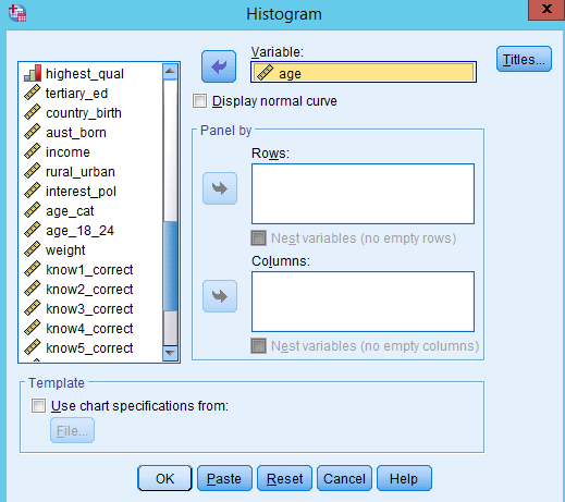
Figure 36: Choose the variable you want to plot.
You will see the histogram of age in the output window (see Figure 36).
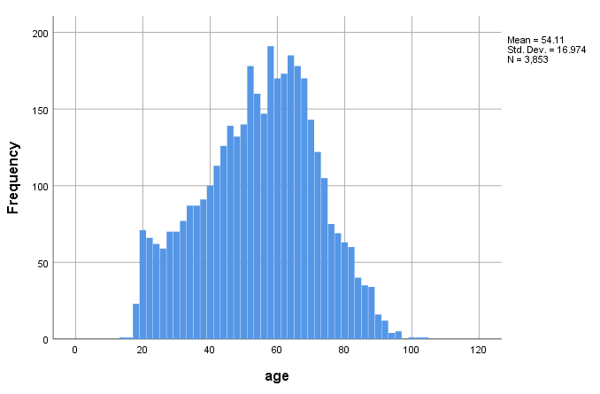
Figure 37: histogram of age
6. Scatterplots
Scatterplots are an effective way to examine bivariate association in a graph format.
To create a scatterplot, go to Graphs > Legacy Dialogs > Scatter/Dot (see Figure 37). When you have only two variables, select the Simple Scatter (see Figure 38).
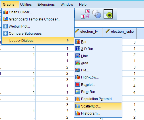
Figure 38: Graphs > Legacy Dialogs > Scatter/Dot
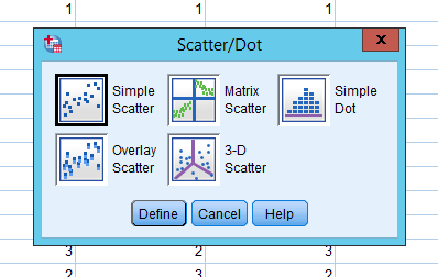
Figure 39: Chose Simple Scatter
In a new popped-up window, 1) move your dependent variable (pol_knowledge) into Y Axis, 2) independent variable (age) into X Axis, and 3) click OK.
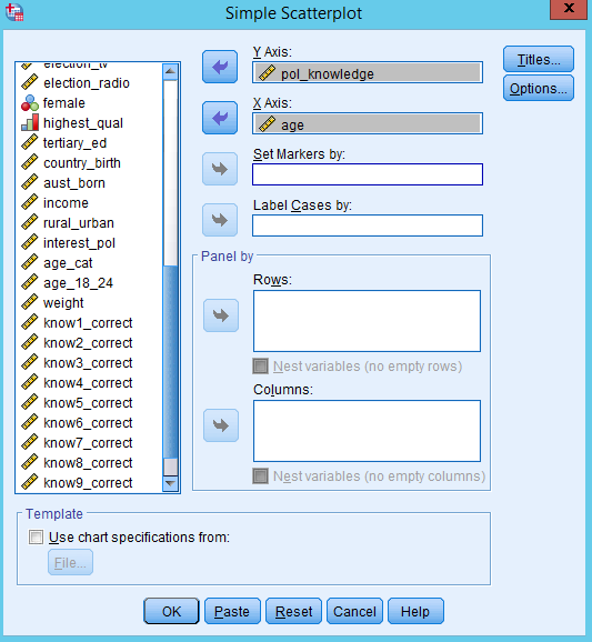
Figure 40: Put your dependent variable in the y axis, and independent variable in the x axis
Figure 40 is the scatterplot of political knowledge by age. Do you see a pattern?
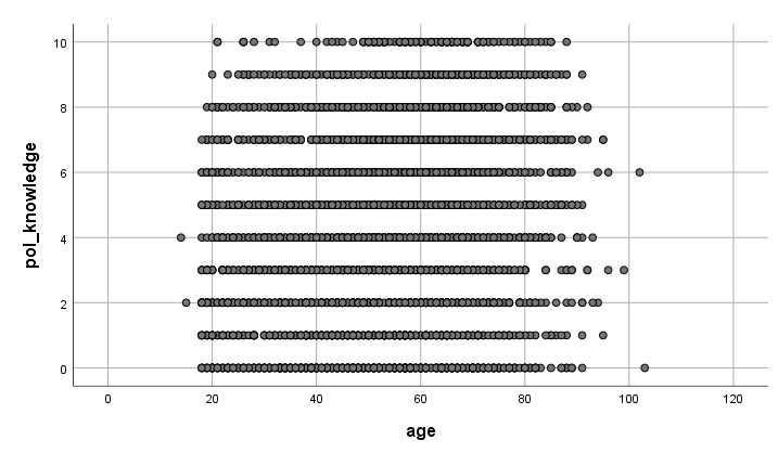
Figure 41: Scatterplot of political knowledge by age.
You can create scatterplots for several different variables so that we can determine whether there are any relationships among those multiple variables. To do so, you should select Matrix Scatter (see Figure 41) and put all the variables of interests into Matrix Variables (see Figure 42). It will return a output seen as Figure 43.
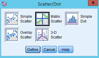
Figure 42: Select Matrix Scatter
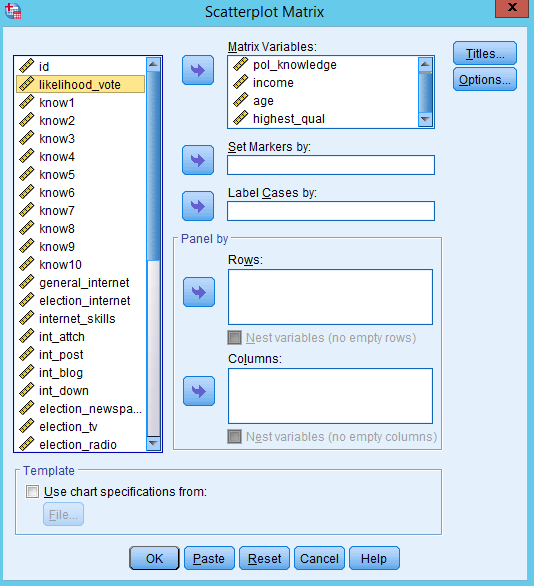
Figure 43: Put variables of interest into Matrix Variable
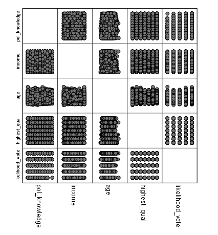
Figure 44: A Matrix Scatterplot
7. How to save SPSS graphs as a format of graphic files
Saving SPSS graphs as a format of graphic files (such as png or jpeg) is a convenient way to keep your graphic outcomes. And then you can import our graphic files into Word, PowerPoint, or iLearn. First, choose the chart you want to save in the output window. Then, right-click on the chart and select “Export”.
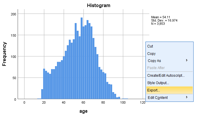
Figure 45: Right-click on the chart and select Export
In the popped-up window, choose “Selected” in Object to Export, “None (Graphics only)” as Document Type, "PNG file (*.png)" as Graphics Type. Of course, you can choose any other graphic formats. Then, click Browse and you specify the folder where the graphic file will be saved.
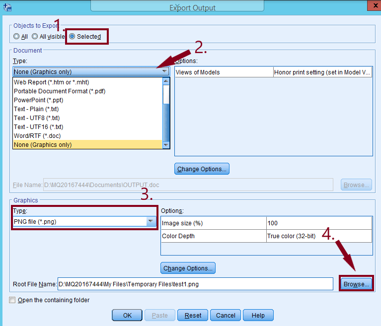
Figure 46: Export Output dialogue box.
In the popped-up window, click a small reverse triangle in the pane of Look in. Then, choose Temporary Files (note, when you close out of your SPSS session all files here will be deleted). You can also put it in your Google Drive if you wanted to by going to the Google Drive folder in this window. Type the file name and click Save.
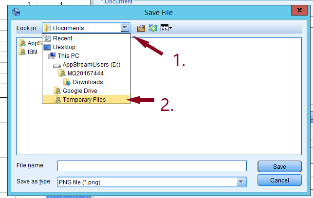
Figure 47: Choose Temporary Files.
Type the file name and click Save. You will be back to the previous window. Then click OK at the bottom.
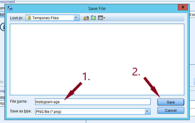
Figure 48: Type in the file name and click save.
Now you must click on the ‘My Files’ which is a part of Appstream and can be seen in Figure 49.
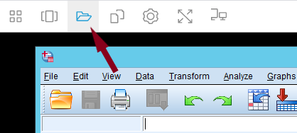
Figure 49: Click on My Files in the top left.
Click on the Temporary Files folder.
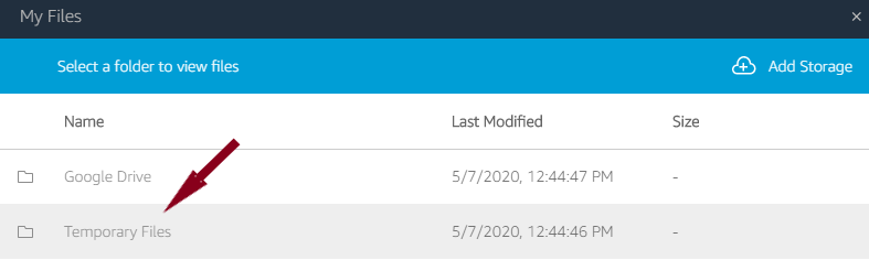
Figure 50: Then click on Temporary Files.
You should see your file here.
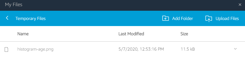
Figure 51: Select your file and it will download.