Reading‘Chapter 7: Correlation’ in Andy Field, 2017. Discovering Statistics Using IBM SPSS Statistics. Sage. |
SOCI2000 Workshop 2: Getting a quick feel for your data (Correlation)
Introduction
One of the most useful forms of analysis to do with your dataset first is a bi-variate correlation.
This allows us to see which of our independent varibles are strongly correlated with our dependent (outcome) variable.
The correct correlation to use is almost always Pearson’s correlation.
Theory
We’re often interested in a simple expression of the relationship between one variable and another.
We can broadly think about three different ways two variables can be related:
- they can be positively correlated (the more you eat, the fuller you feel) - the first two scatterplots in Figure 1.
- they can be negatively correlated (the more you eat, the less food is on your plate) - the last two scatter plots in Figure 1
- there can be no correlation (the number of sunspots, and how much you eat) - the middle scatterplot in Figure 1
](/img/quant_analysis_lab_04_image_01b.png)
Figure 1: Five different scatter plots. Author: Denis Boigelot. Source: Wikimedia
Correlation coefficients, such as the Pearson correlation coefficient, allow us to put an exact number on the size of the correlation between two variables.
The formal equation for pearson’s correlation coefficient (also called ‘r’) is
\[r = \frac{\sum_{i=1}^n (x_i - \bar x)(y_i - \bar y)}{(N-1)s_x s_y}\]
\[ Where: \] \[ \bar x = \text{mean of x} \] \[ \bar y = \text{mean of y} \] \[ \bar N = \text{number of observations} \] \[ s_x = \text{standard deviation of x} \] \[ s_y = \text{standard deviation of y} \]
While this equation may be scary, the general interpretation of correlation coefficients not difficult:
- correlation coefficients vary from -1 to 1
- positive values (i.e. greater than zero, up to 1) represent a positive correlation
- negative values (i.e. less than zero, down to -1) represent a negative correlation
- values close to zero mean that there is no significant relationship between the two variables (the two variables are independent of each other)
- larger values (in absolute terms - closer to 1 or -1) reflect a stronger relationship
- A rule of thumb is that a Pearson’s correlation of 0.1-0.2 represents a weak relationship, 0.3-0.4 a moderate one and 0.5+ a strong relationship (all of these are absolute values).
Figure 2, below, shows visualisations of different correlation coefficients.
](/img/quant_analysis_lab_04_image_01a.png)
Figure 2: Visual illustration of different correlation coefficients. Author: Denis Boigelot. Source: Wikimedia
Two Tables
There are two main types of correlation tables you might want to produce:
- a table which shows the correlation of all the independent variables with the dependent variable/s.
- a matrix which shows the correlation of all variables with all other varibles
Figures 3 and 4 below show examples of these.
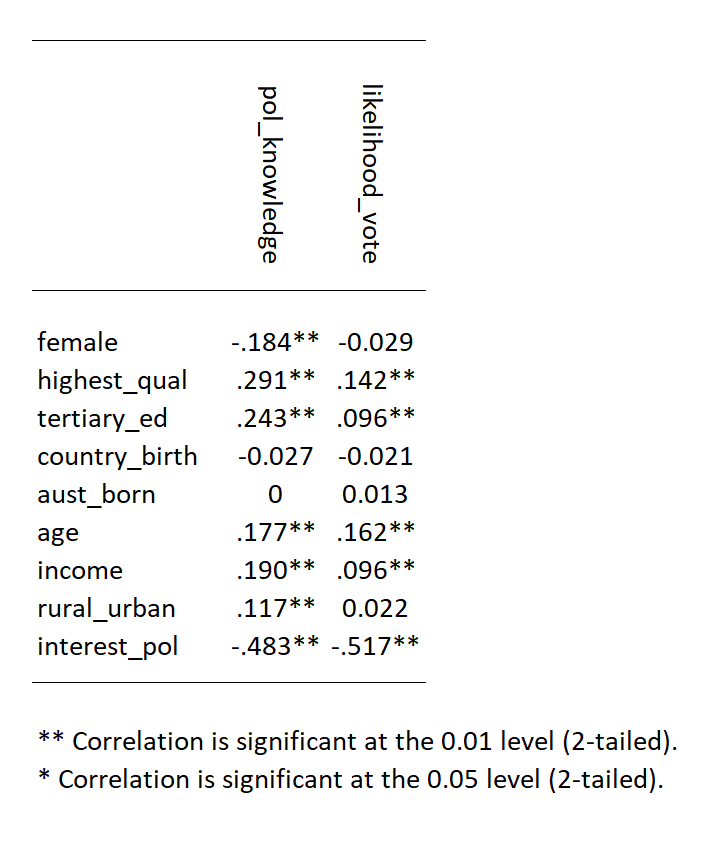
Figure 3: A table with the correlation between the two independent variables and the main independent variables.
Figures 3 and 4 below show examples of these.
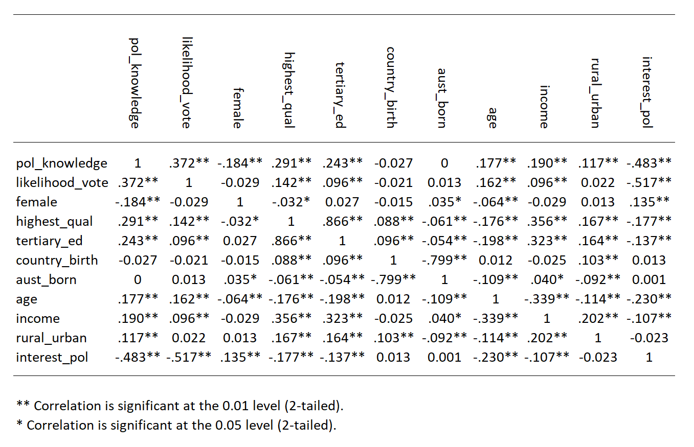
Figure 4: A matrix with the correlation between the main variables.
Figures 3 and 4 below show examples of these.
Pearsons Correlation
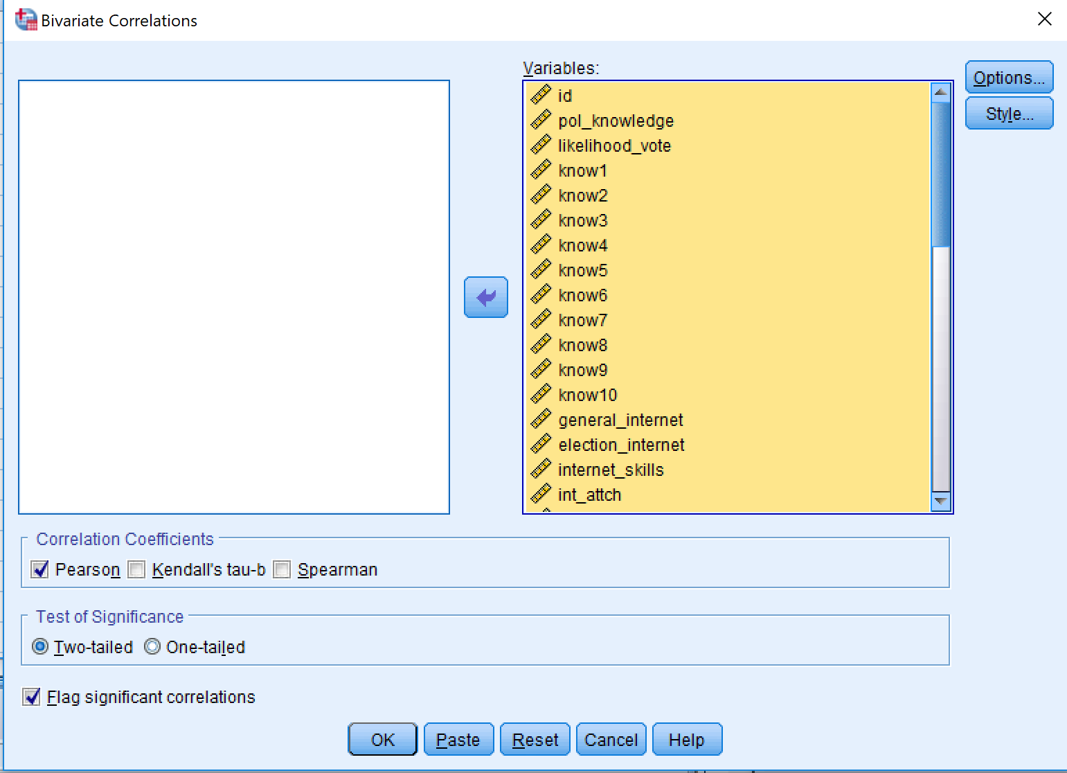
- Go to Analyze > Correlate > Bivariate
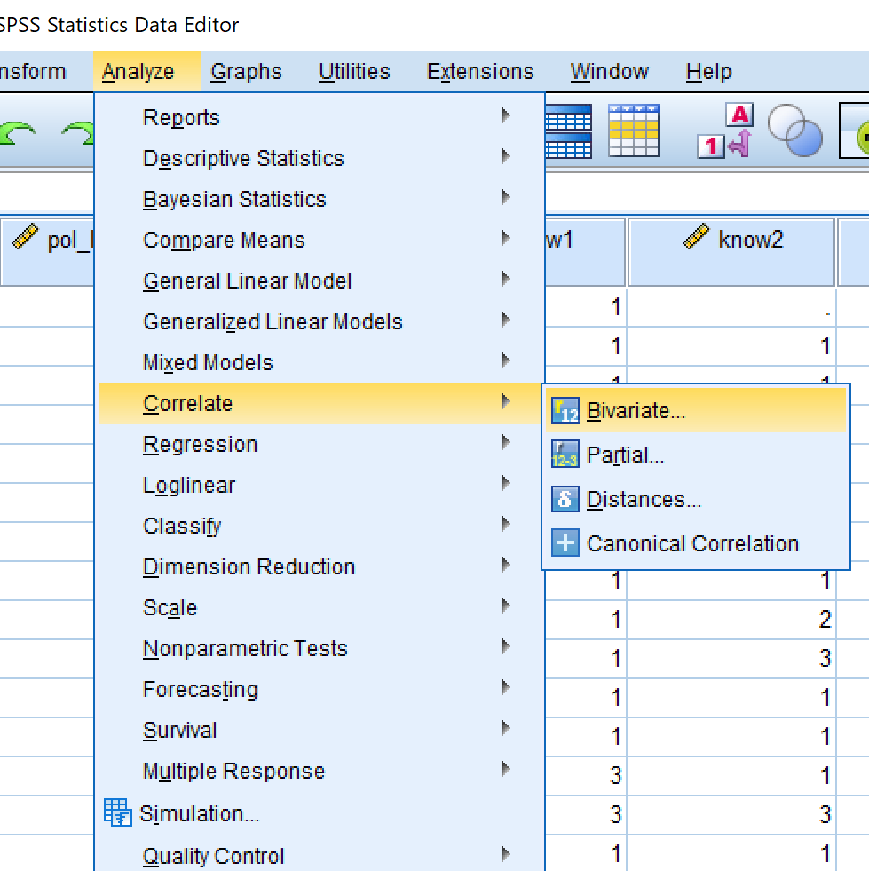
The left window contains all the variables in your dataset NOT in the correlation. The right window contains all the variables in the correlation.
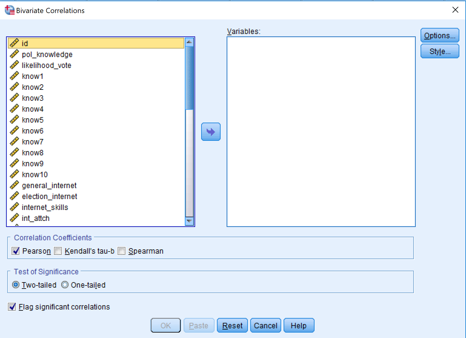
For this analysis, you want everything in the analysis. So click on one of the variables in the left window and then press ‘Control + A’. This will ‘select all’.
Then click the arrow in the middle of the screen. This will move all the variables to the right.
The default options are fine, so then just click “OK”
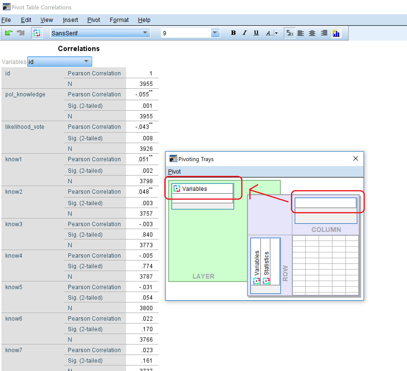
- You should see a huge, almost unreadable, table like the one below. This version can be useful for identifying correlations between your independent variables.
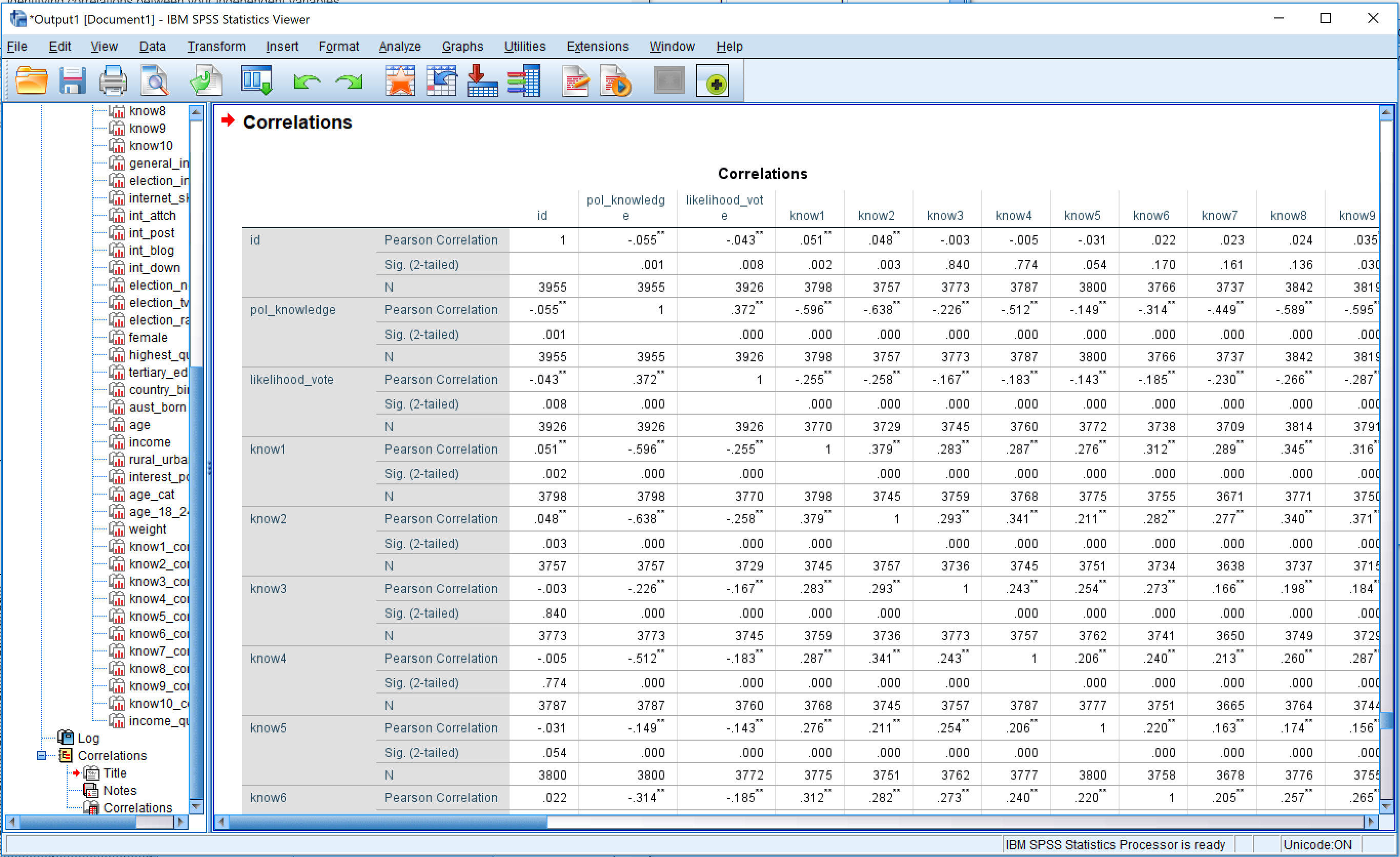
- Double click anywhere on the table, and ‘Pivot Table’ should appear
- If the ‘Pivot Trays’ are not showing go to Pivot>Pivot Trays
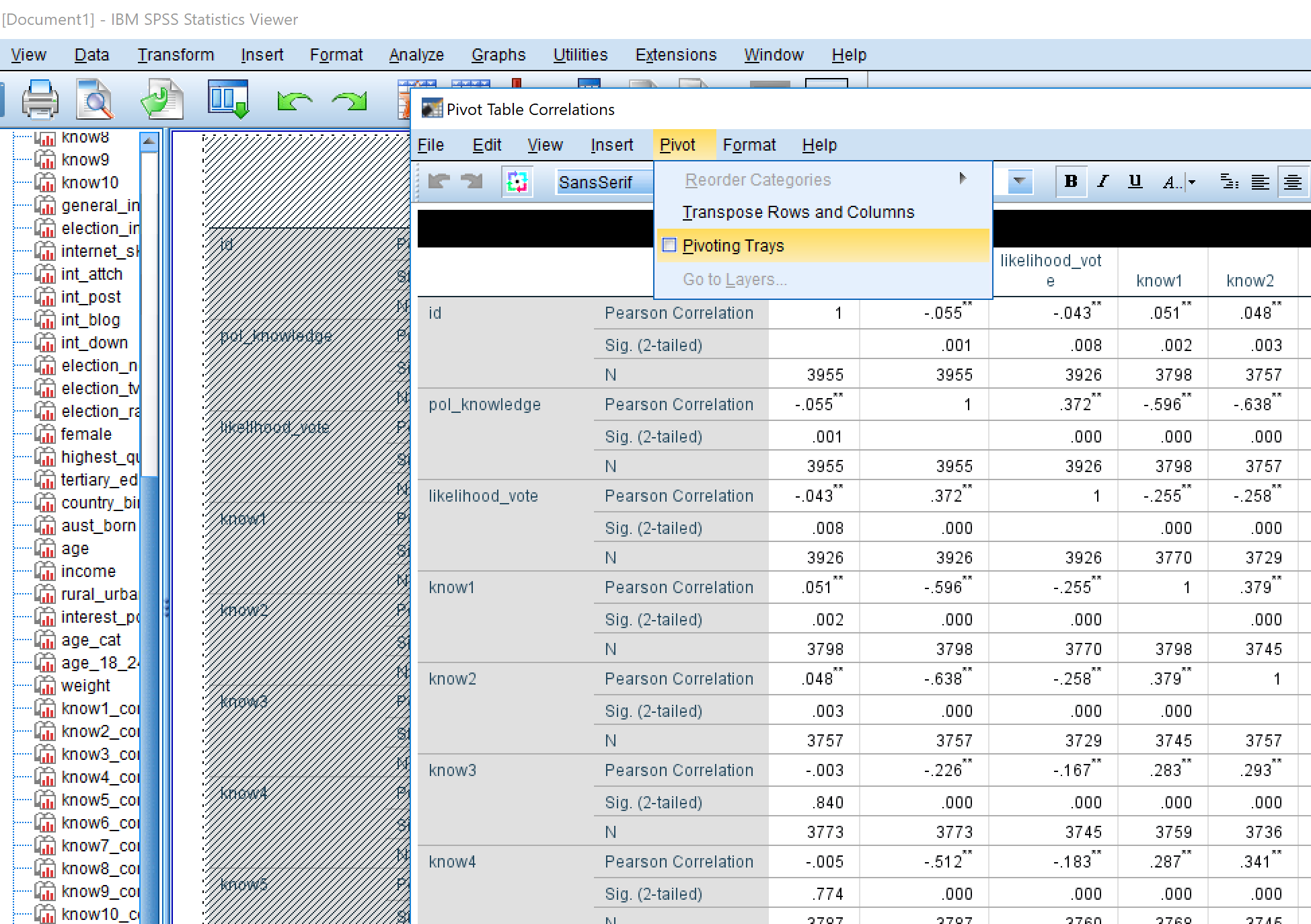
- The Pivot Trays should appear as below.
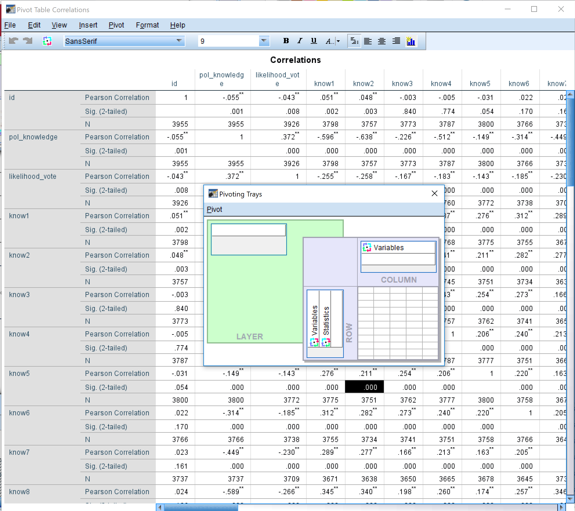
- Click and hold the vertically written word ‘Variables’, and drag it to the top white box on the ‘LAYER’
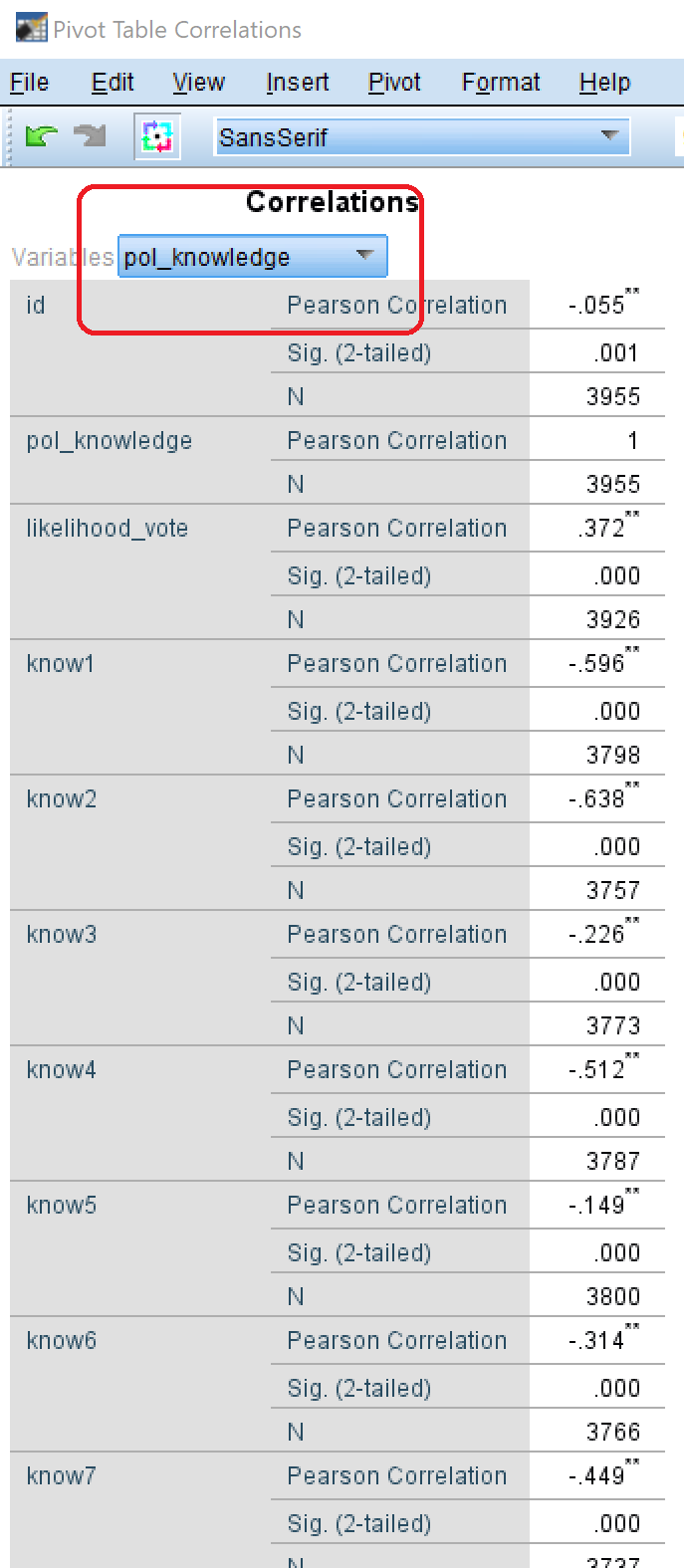
- On the Pivot Table, you will see a drop down box. Click on this and select your dependent variable. You will now have a list of the bivariate correlations of all your independent variables with your dependent variable.
Making Publishable Tables
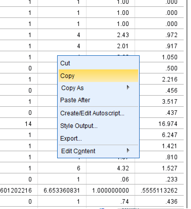
If you are writing a report and you need to put these descriptive statistics into a report, then DO NOT just make a screenshot of the SPSS output.
Instead, what you should do is:
- right click on the table you want to copy, and select ‘copy’
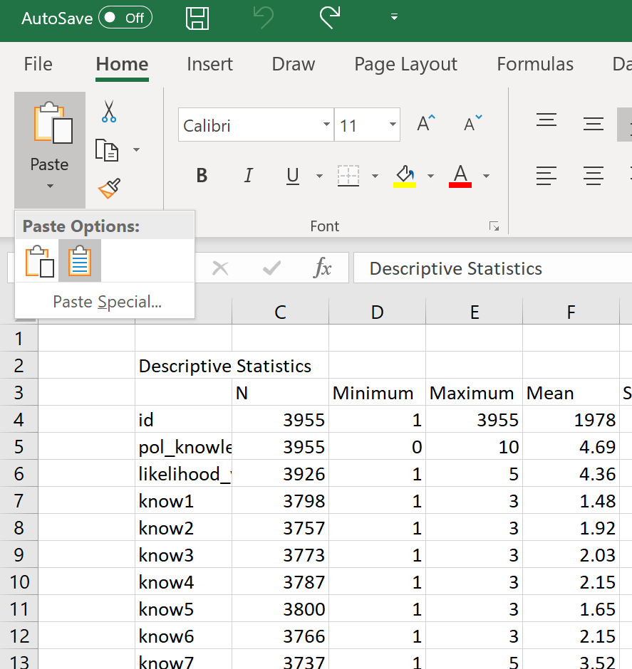
- open Excel, and then paste as text (this will strip out formating). Option could be called “Keep Text Only (T)” or “Match destination formating (M)”.
- In Excel, delete the rows for N (number of cases), and the significance (it is already indicated in the stars /* and // )
- Orient the column headings vertically (select cells, then right click>Format cells…>Alignment>Orientation)
- Create three vertical lines in the table: (1) at the top of the table, (2) at the bottom of the table, and (3) under the column headings.
- Align the columns with numbers in them to the centre (keep the first column, with the variable names, left-aligned)
- AutoFit the column widths by selecting all the columns and then double clicking boundary between any two column headings.
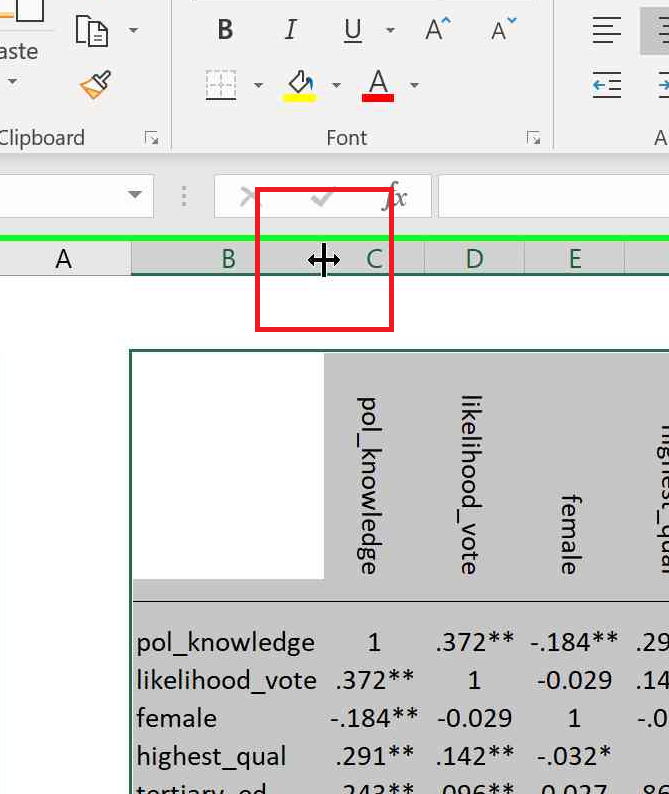
- Turn off gridlines (View>Gridlines)
- Take a screenshot of the table and paste into your report.