The fifth lab session covers the following:
- How to make a frequency table
- How to compute the mode
- How to calculate descriptive statistics
- How to visualise the distribution
We will use four packages for this lab. Load them using the following code:
library(sjlabelled)
library(sjmisc)
library(sjPlot)
library(summarytools)
Note that the loading order of packages is important. If you do not follow the suggested loading order, you will not get the same result as in the all below examples.
Also, you may see a error messages especially when you load summarytools. Please ignore them. It will not affect your analytic outcomes.
Import the 2019 AuSSa dataset.
This lab uses the 2019 AuSSa dataset. You can download the file of this dataset in the course website(iLearn). Download the data file and put it into your working directory. Then, run the following code:
aus2019 <-readRDS("aussa2019.rds")The dataset is loaded as aus2019.
How to make a frquency table
I briefly introduced how to make a frequency table in Lab 4. ‘frq(data name$variable name)’ generates a frequency table. For instance, the following code produces a frequency table of sex in aus2019:
frq(aus2019$sex) ## Sex of Respondent (x) <numeric>
## # total N=1068 valid N=1049 mean=1.51 sd=0.50
##
## Value | Label | N | Raw % | Valid % | Cum. %
## -----------------------------------------------
## 1 | Male | 517 | 48.41 | 49.29 | 49.29
## 2 | Female | 532 | 49.81 | 50.71 | 100.00
## <NA> | <NA> | 19 | 1.78 | <NA> | <NA>In the outcome, NA means missing values (item non-responses). N are frequencies, Raw % denotes raw percentages (based on the number of total cases), Valid % indicates valid percentages (based on the number of valid cases), and Cum. % means cumulative percentages.
Alternatively, you can make a frequency table using ‘freq()’ from summarytools package. I prefer to use ‘freq()’ because this function provides more detailed information.
freq(aus2019$sex) ## Frequencies
## aus2019$sex
## Label: Sex of Respondent
## Type: Numeric
##
## Freq % Valid % Valid Cum. % Total % Total Cum.
## ----------- ------ --------- -------------- --------- --------------
## 1 517 49.29 49.29 48.41 48.41
## 2 532 50.71 100.00 49.81 98.22
## <NA> 19 1.78 100.00
## Total 1068 100.00 100.00 100.00 100.00The problem of this output is that value labels are not shown in the frequency table. This is because summarytools package does not support the value labels assigned by sjlabelled package. To show value labels, we need to add one more function: ‘to_label()’.
freq(to_label(aus2019$sex))## Frequencies
##
## Freq % Valid % Valid Cum. % Total % Total Cum.
## ------------ ------ --------- -------------- --------- --------------
## Male 517 49.29 49.29 48.41 48.41
## Female 532 50.71 100.00 49.81 98.22
## <NA> 19 1.78 100.00
## Total 1068 100.00 100.00 100.00 100.00Now, you can see the labels of all values in the frequency table. In the table, Freq is frequencies, % Valid indicates valid percentages (based on the number of valid cases), and % Valid Cum. means cumulative percentages based on valid cases, % Total denotes raw percentages (based on the number of total cases), and % Total Cum. is cumulative percentages based on total cases. Also, this frequency table provides the number of total cases at the bottom row.
The next codes will create frequency tables of marital (marital status of respondents) and incgap (whether respondents agree or disagree that the income gap in Australia is too large).
freq(to_label(aus2019$marital))## Frequencies
##
## Freq % Valid % Valid Cum. % Total % Total Cum.
## -------------------------------------------------------------------------------------------------------- ------ --------- -------------- --------- --------------
## Married 645 63.24 63.24 60.39 60.39
## Separated from spouse/ civil partner (still legally married/ still legally in a civil partnership) 22 2.16 65.39 2.06 62.45
## Divorced from spouse/ legally separated from civil partner; AT: Divorced/ Separated 93 9.12 74.51 8.71 71.16
## Widowed/ civil partner died 50 4.90 79.41 4.68 75.84
## Never married/ never in a civil partnership 210 20.59 100.00 19.66 95.51
## <NA> 48 4.49 100.00
## Total 1068 100.00 100.00 100.00 100.00freq(to_label(aus2019$incgap))## Frequencies
##
## Freq % Valid % Valid Cum. % Total % Total Cum.
## -------------------------------- ------ --------- -------------- --------- --------------
## Strongly agree 325 31.74 31.74 30.43 30.43
## Agree 448 43.75 75.49 41.95 72.38
## Neither agree nor disagree 163 15.92 91.41 15.26 87.64
## Disagree 76 7.42 98.83 7.12 94.76
## Strongly disagree 12 1.17 100.00 1.12 95.88
## <NA> 44 4.12 100.00
## Total 1068 100.00 100.00 100.00 100.00How to make a frequency table of age groups
The frequency table of continuous variables is not easy to read because there are so many values in them. Consequently, researchers often transform continuous variables into ordinal ones and then create the frequency table. Let’s make the frequency table of respondents’ age. We will first recode age into a variable of age groups (You did this in Lab 4. see Creating a Variable of Age Groups) and then make the frequency table of age groups.
aus2019 <- rec(aus2019, age, rec = "min:19 = 1; 20:29 = 2; 30:39 = 3; 40:49 = 4;
              50:59 = 5; 60:69 = 6; 70:79 = 7; 80:89 = 8; 90:max = 9",
              append = TRUE)
aus2019$age_r <- set_label(aus2019$age_r, label = "Age Category")
aus2019$age_r <- set_labels(aus2019$age_r, labels = c ("10s" = 1,
                                                     "20s" = 2,
                                                     "30s" = 3,
                                                     "40s" = 4,
                                                     "50s" = 5,
                                                     "60s" = 6,
                                                     "70s" = 7,
                                                     "80s" = 8,
                                                     "90s" = 9))
freq(to_label(aus2019$age_r))
## Frequencies
##
## Freq % Valid % Valid Cum. % Total % Total Cum.
## ----------- ------ --------- -------------- --------- --------------
## 10s 6 0.60 0.60 0.56 0.56
## 20s 72 7.26 7.86 6.74 7.30
## 30s 103 10.38 18.25 9.64 16.95
## 40s 136 13.71 31.96 12.73 29.68
## 50s 199 20.06 52.02 18.63 48.31
## 60s 254 25.60 77.62 23.78 72.10
## 70s 165 16.63 94.25 15.45 87.55
## 80s 54 5.44 99.70 5.06 92.60
## 90s 3 0.30 100.00 0.28 92.88
## <NA> 76 7.12 100.00
## Total 1068 100.00 100.00 100.00 100.00Note
When you run the above code to recode age variable, you might see a warning message saying:
“Unknown or uninitialised column: ‘age_r’”
This is because you have recoded age variable multiple times. Please check your dataset by running the following code:
names(aus2019)It will show all the names of variables in aus2019 dataset. At the end of the variable list, you will see multiply recoded age variables such as age_r…104, age_r…105 and etc. You need to remove them. You can remove them by aus2019$variable name <- NULL. For example,
aus2019$age_r...104 <- NULL
aus2019$age_r...105 <- NULL
After removing them, recode age variable again just one time. It will fix the problem.
How to compute the mode
R does not have a built-in function to compute a mode of a variable. So, I made a function called ‘getmode()’ which lets you calculate the mode. First, run the following code:
getmode <- function(x) {
  ux <- unique(na.omit(x))
  tx <- tabulate(match(x, ux))
  if(length(ux) != 1 & sum(max(tx) == tx) > 1) {
    if (is.character(ux)) return(NA_character_) else return(NA_real_)
  }
  max_tx <- tx == max(tx)
  return(ux[max_tx])
}
You will see getmode in the tab of Environment. This is the custom function you just added. Thus, every time you want to compute the mode, you need to run the above code first.
Let’s caculate the mode of sex, martial, incgap, age and age_r. Again, we will use ’to_label() function for nominal and ordinal variables to see value labels instead of values.
getmode(to_label(aus2019$sex))## [1] Female
## Levels: Male Femalegetmode(to_label(aus2019$marital))## [1] Married
## 5 Levels: Married ...getmode(to_label(aus2019$incgap))## [1] Agree
## 5 Levels: Strongly agree Agree Neither agree nor disagree ... Strongly disagreegetmode(to_label(aus2019$age))## [1] 60getmode(to_label(aus2019$age_r))## [1] 60s
## Levels: 10s 20s 30s 40s 50s 60s 70s 80s 90sThe results show that ‘Female’ is the mode for sex, ‘Married’ for marital, ‘Agree’ for incgap, 60 for age, and ‘60s’ for age_r.
How to compute descriptive statistics
‘descr()’ from summarytools package shows various descriptive statistics. The notable statistics include:
- Mean
- Std.Dev. (Standard Deviation)
- Min (Minimum Value)
- Q1 (25th percentile)
- Median (50th percentile)
- Q3 (75th percentile)
- Max (Maximum Value)
- IQR (Inter-quartile Range)
- Skewness
- N.Valid (Number of Valid Cases)
- % Valid (Percentage of Valid Cases)
The following code shows descriptive statistics of incgap(ordinal variable):
descr(aus2019$incgap)## Descriptive Statistics
## aus2019$incgap
## Label: Q4a Differences in income in [COUNTRY] are too large.
## N: 1068
##
## incgap
## ----------------- ---------
## Mean 2.03
## Std.Dev 0.94
## Min 1.00
## Q1 1.00
## Median 2.00
## Q3 2.00
## Max 5.00
## MAD 1.48
## IQR 1.00
## CV 0.46
## Skewness 0.83
## SE.Skewness 0.08
## Kurtosis 0.29
## N.Valid 1024.00
## Pct.Valid 95.88Please note that in case of ordinal variables, you need to be careful in interpreting the results. For instance, the median value of incgap is 2, which means the median response is “Agree”.
The following code will show descriptive statistics of age(continuous variable):
descr(aus2019$age)## Descriptive Statistics
## aus2019$age
## N: 1068
##
## age
## ----------------- --------
## Mean 56.20
## Std.Dev 16.39
## Min 18.00
## Q1 43.50
## Median 59.00
## Q3 68.00
## Max 99.00
## MAD 16.31
## IQR 24.25
## CV 0.29
## Skewness -0.33
## SE.Skewness 0.08
## Kurtosis -0.58
## N.Valid 992.00
## Pct.Valid 92.88How to visualise the distribution
There are many packages to visualise your data in R. In this unit I will use sjPlot package because it supports the labels assigned by sjlabelled package and because it is easy to use. If you want to learn more advanced graphics of R, I recommend using ggplot2 package. One good reliable online resource is here.
Note: The graph or chart will be displayed in the tab of Plots at the bottom left pane. Sometimes the window of Plots is too small to show the whole graph. Thus, you may need to change the size of the Plots window.
To change the size of the Plots window (see <Figure 1>), 1. Move the cursor at the border between top left and bottom left pane. The icon of mouse cursor will be changed. 2. Hold clicking the mouse and change the height. 3. Move the cursor at the border between left and right panes. The icon of mouse cursor will be changed. 4. Hold clicking the mouse and change the width.
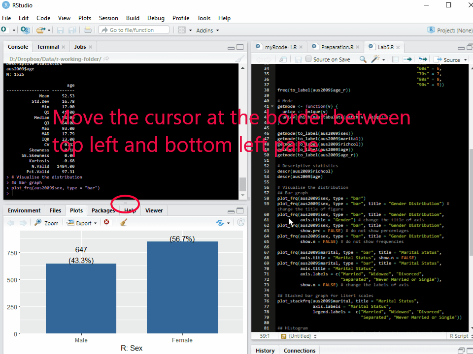
Figure 1: Changing the Size of Plots Window
How to make bar graphs
Bar graphs provide appropriate ways to present nominal or ordinal variables graphically. ‘plot_frq(data name$variable name, type = "bar")’ makes a bar graph of the specified variable. For example, the following code will make a bar graph of sex in aus2019:
plot_frq(aus2019$sex, type = "bar")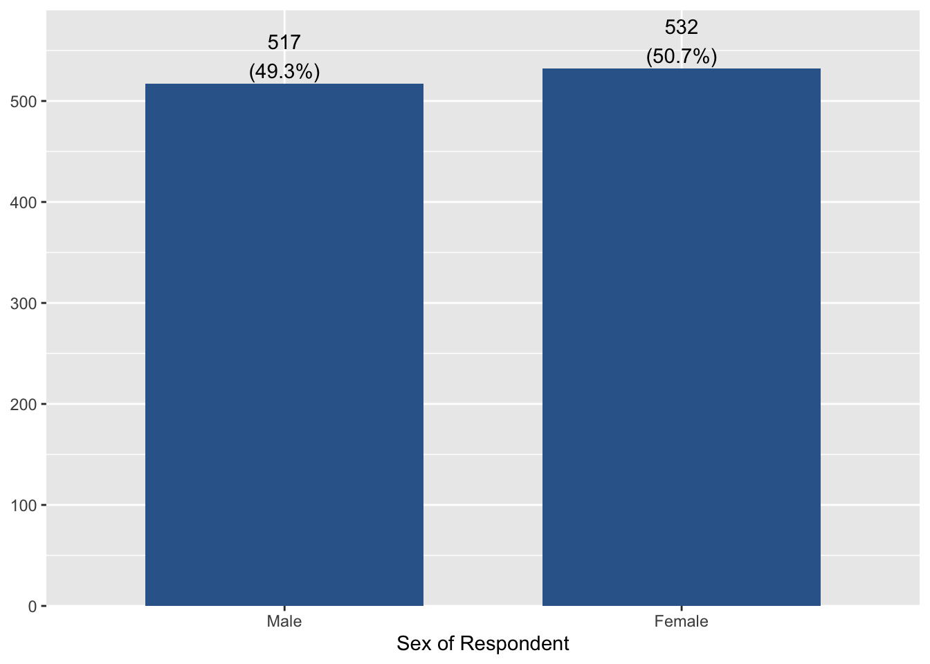
If you want to add the title of a figure, add ‘title = "Any title"’ to the code. The following code will add “Gender distribution” as the title of the figure:
plot_frq(aus2019$sex, type = "bar", title = "Gender Distribution") 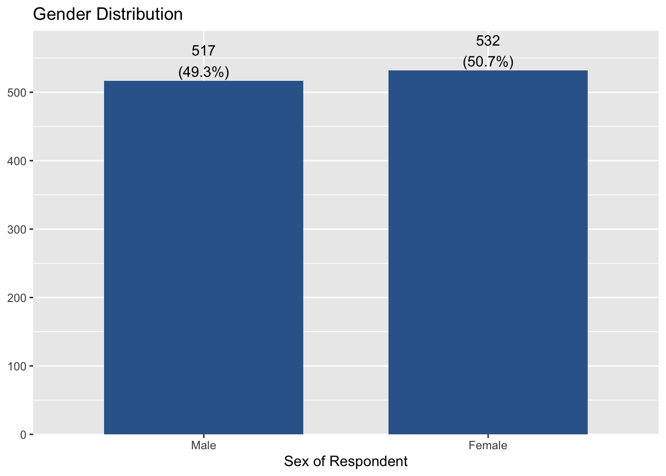
You can change the title of X-axis by adding ‘axis.title = "Any title"’. I change it into “Gender”. Thus, the code is:
plot_frq(aus2019$sex, type = "bar", title = "Gender Distribution",
axis.title = "Gender") 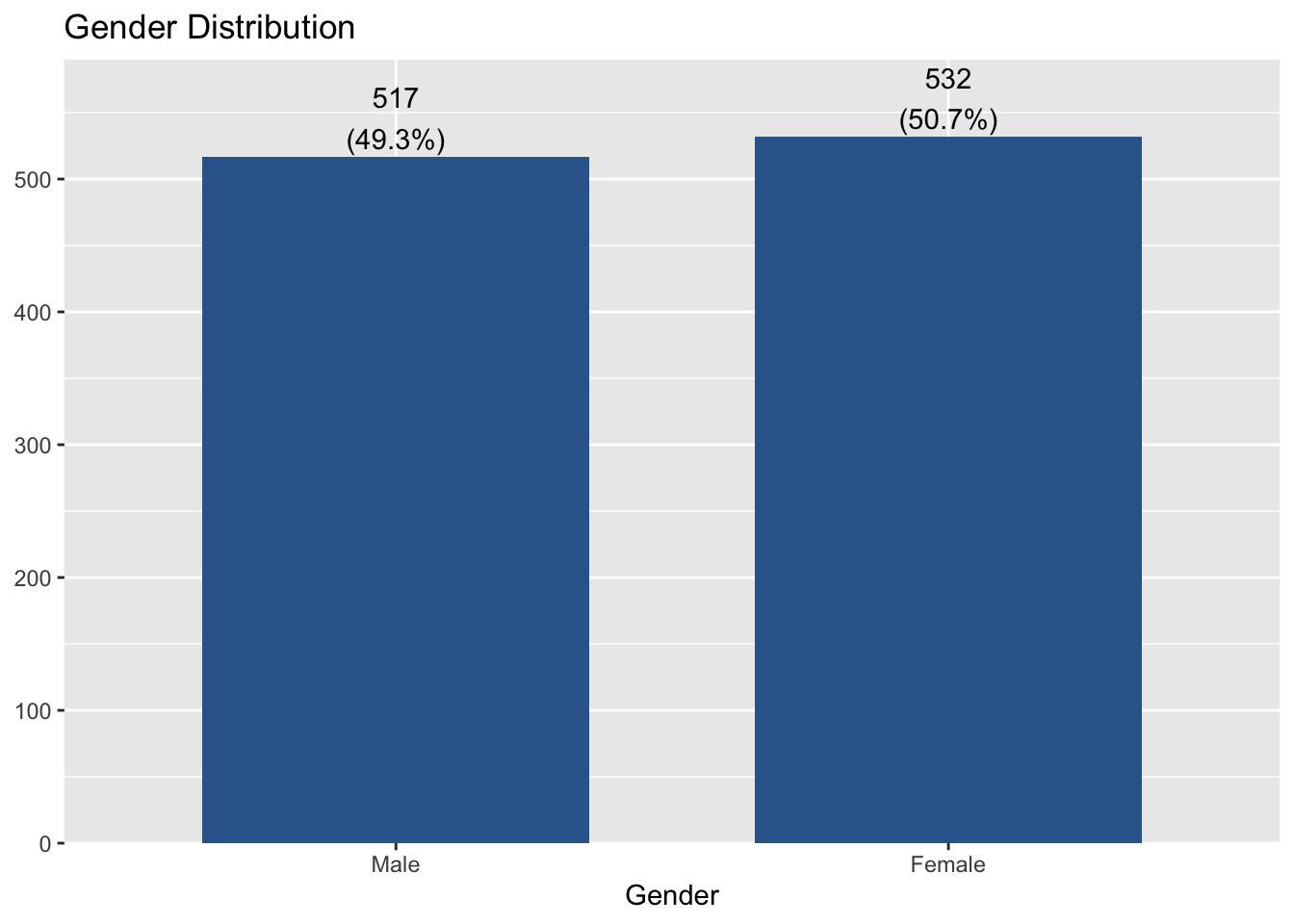
If you want to remove percentages of each category at the top of bars, add ‘show.prc = FALSE’ to the code.
plot_frq(aus2019$sex, type = "bar", title = "Gender Distribution",
        show.prc = FALSE)
If you want to remove frequencies of each category at the top of bars, add ‘show.n = FALSE’ to the code.
plot_frq(aus2019$sex, type = "bar", title = "Gender Distribution",
        show.n = FALSE)
Next, let’s make a bar graph of another variable, marital.
plot_frq(aus2019$marital, type = "bar", title = "Marital Status",
        axis.title = "Marital Status", show.n = FALSE)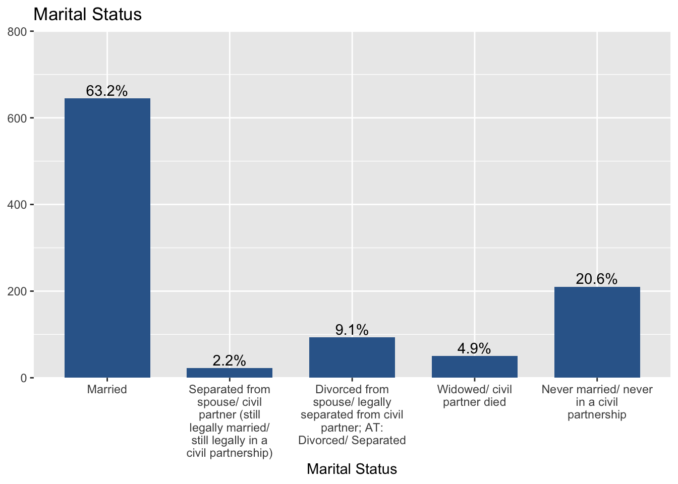
You may notice that one axis label is too long, which makes it difficult to read other labels. So, we will change this long label into a more brief one. To change the axis label, ‘axis.labels’ option will be used.
plot_frq(aus2019$marital, type = "bar", title = "Marital Status",
        axis.title = "Marital Status",
        axis.labels = c("Married", "Widowed", "Divorced",
                        "Separated", "Never Married or Single"),
        show.n = FALSE)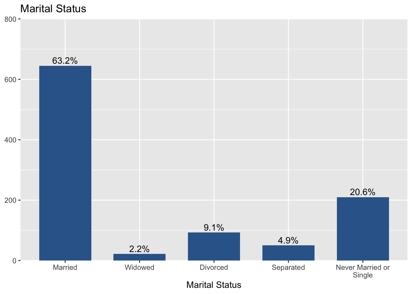
We assigned “Married”, “Widowed”, “Divorced”, “Separated”, and “Never Married or Single” to labels of each axis, respectively.
How to make stacked bar graphs
A stacked bar graph is used to break down and compare parts of a whole. Each bar in the graph represents a whole, and segments in the bar represent different categories or responses of that whole. Stacked bar graphs can be created by ‘plot_stackfrq(data name$variable name)’. The following code makes a stacked bar graph of marital:
plot_stackfrq(aus2019$marital, title = "Marital Status",
    axis.labels = "Marital Status",
    legend.labels =  c("Married", "Widowed", "Divorced",
                       "Separated", "Never Married or Single"))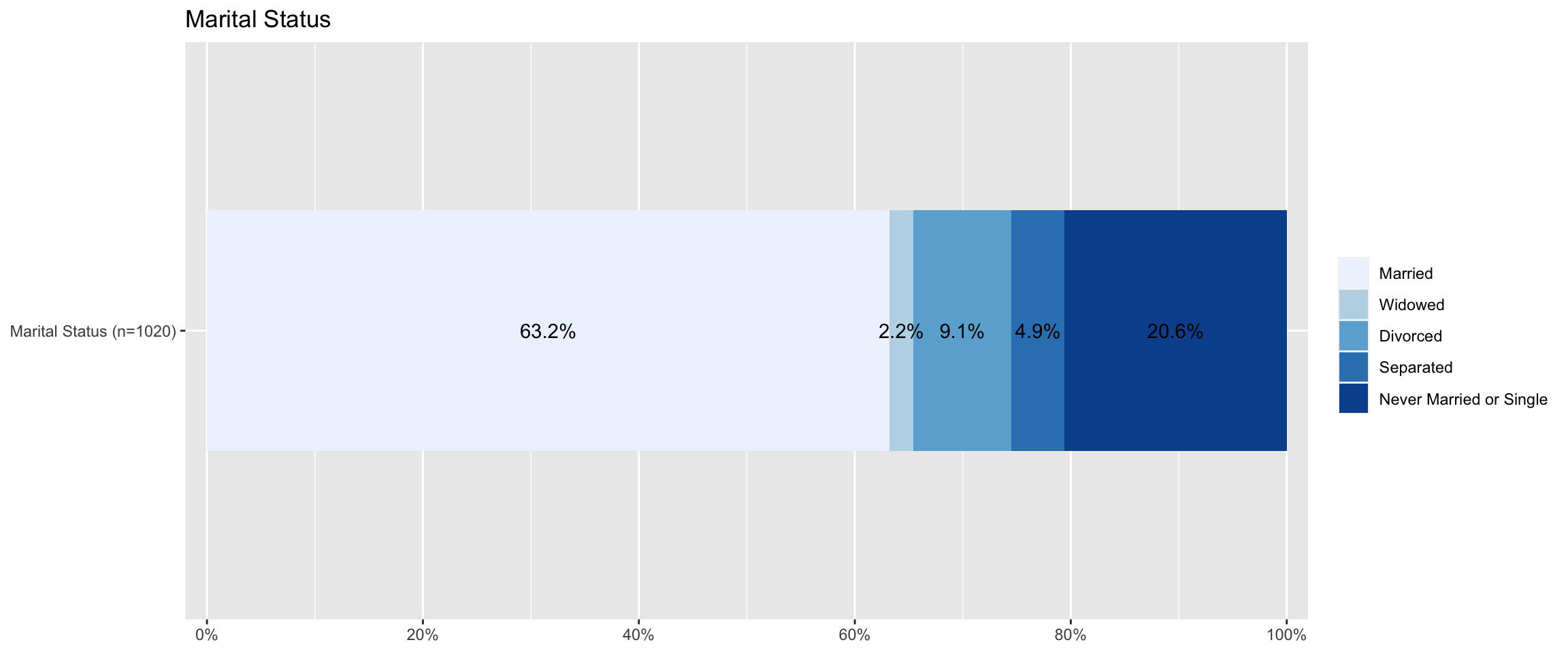
Note that I changed the label of axis and legend using ‘axis.labels’ and ‘legend.labels’ option.
How to make histograms
Histograms are used for continuous variables which have many scores. Histograms look like bar graphs, except that the sides of the “bars” touch to form a continuous series.
To make histograms, use ‘plot_frq(data name$variable name, type = "hist")’. The following code creates a histogram of age.
plot_frq(aus2019$age, type = "hist", title = "Distribution of Age", axis.title = "Age")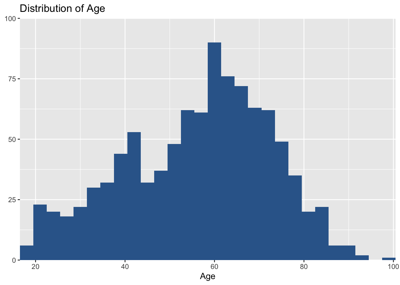
In this graph, I would like to set the distance between axis tick labels equal to 10. So, I add ‘grid.breaks = 10’ to the code. Thus, the code is:
plot_frq(aus2019$age, type = "hist", title = "Distribution of Age", axis.title = "Age",
        grid.breaks = 10)
Save the dataset
Save your dataset. Otherwise, you will lose a newly constructed variable (age_r).
saveRDS(aus2019, file = "aussa2019.rds")
Lab 5 Participation Activity |
Note: Please complete the Lab 5 Participation Activity. You can find the link to this activity on iLearn. This activity will contribute to your participation marks. |
The R codes you have written so far look like:
################################################################################
# Lab 5: Univariate Analysis
# 27/03/2024
# SOCI8015 & SOCX8015
################################################################################

# load packages
library(sjlabelled)
library(sjmisc)
library(sjPlot)
library(summarytools)

# load Aussa2009
aus2019 <-readRDS("aussa2019.rds")

# Frequency table
frq(aus2019$sex)
freq(aus2019$sex)
freq(to_label(aus2019$sex))

freq(to_label(aus2019$marital))
freq(to_label(aus2019$incgap))

# Make a frequency table of age gropus
aus2019 <- rec(aus2019, age, rec = "min:19 = 1; 20:29 = 2; 30:39 = 3; 40:49 = 4;
              50:59 = 5; 60:69 = 6; 70:79 = 7; 80:89 = 8; 90:max = 9",
               append = TRUE)
aus2019$age_r <- set_label(aus2019$age_r, label = "Age Category")
aus2019$age_r <- set_labels(aus2019$age_r, labels = c ("10s" = 1,
                                                       "20s" = 2,
                                                       "30s" = 3,
                                                       "40s" = 4,
                                                       "50s" = 5,
                                                       "60s" = 6,
                                                       "70s" = 7,
                                                       "80s" = 8,
                                                       "90s" = 9))
freq(to_label(aus2019$age_r))

# Mode
getmode <- function(x) {
  ux <- unique(na.omit(x))
  tx <- tabulate(match(x, ux))
  if(length(ux) != 1 & sum(max(tx) == tx) > 1) {
    if (is.character(ux)) return(NA_character_) else return(NA_real_)
  }
  max_tx <- tx == max(tx)
  return(ux[max_tx])
}

getmode(to_label(aus2019$sex))
getmode(to_label(aus2019$marital))
getmode(to_label(aus2019$incgap))
getmode(to_label(aus2019$age))
getmode(to_label(aus2019$age_r))

# Descriptive statistics
descr(aus2019$incgap)
descr(aus2019$age)

# Visualise the distribution
## Bar graph
plot_frq(aus2019$sex, type = "bar")
plot_frq(aus2019$sex, type = "bar", title = "Gender Distribution") # change the title of figure
plot_frq(aus2019$sex, type = "bar", title = "Gender Distribution",
         axis.title = "Gender") # change the title of axis
plot_frq(aus2019$sex, type = "bar", title = "Gender Distribution",
         show.prc = FALSE) # do not show percentages
plot_frq(aus2019$sex, type = "bar", title = "Gender Distribution",
         show.n = FALSE) # do not show frequencies

plot_frq(aus2019$marital, type = "bar", title = "Marital Status",
         axis.title = "Marital Status", show.n = FALSE)
plot_frq(aus2019$marital, type = "bar", title = "Marital Status",
         axis.title = "Marital Status",
         axis.labels = c("Married", "Widowed", "Divorced",
                         "Separated", "Never Married or Single"),
         show.n = FALSE) # change the labels of axis

## Stacked bar graph for Likert scales
plot_stackfrq(aus2019$marital, title = "Marital Status",
              axis.labels = "Marital Status",
              legend.labels =  c("Married", "Widowed", "Divorced",
                                 "Separated", "Never Married or Single"))

## Histogram
plot_frq(aus2019$age, type = "hist", title = "Distribution of Age", axis.title = "Age")
plot_frq(aus2019$age, type = "hist", title = "Distribution of Age", axis.title = "Age",
         grid.breaks = 10) # grid.breks:sets the distance between breaks for the axis

# Save dataset
saveRDS(aus2019, file = "aussa2019.rds")