Reading |
|
Google Sheets dataset used in The Guardian Australia analysis. |
Overview of Lesson 1.1 |
|
Time: 20 minutes Objectives By the end of this lesson students should be able to:
|
Reading |
|
Google Sheets dataset used in The Guardian Australia analysis. |
Overview of Lesson 1.1 |
|
Time: 20 minutes Objectives By the end of this lesson students should be able to:
|
On Saturday 18 May 2019 there was an Australian Federal Election.
Anyone in Australia who was vaguely political - irrespective of their beliefs - was shocked by about 10pm that evening.
The conservative parties in Australia (Liberal/National Coalition) had achieved a surprising win - going against all the published polling.
A few days after the election an article was published in The Guardian Australia which attempted to use the tools of quantitative analysis to explain - in just eight charts - why the conservative parties had won.
This article and the eight charts are a powerful testament to the power of many of the skills you will learn in this course.
Figure 1, Figure 2, and Figure 3 are good examples of the type of charts provided in The Guardian article.
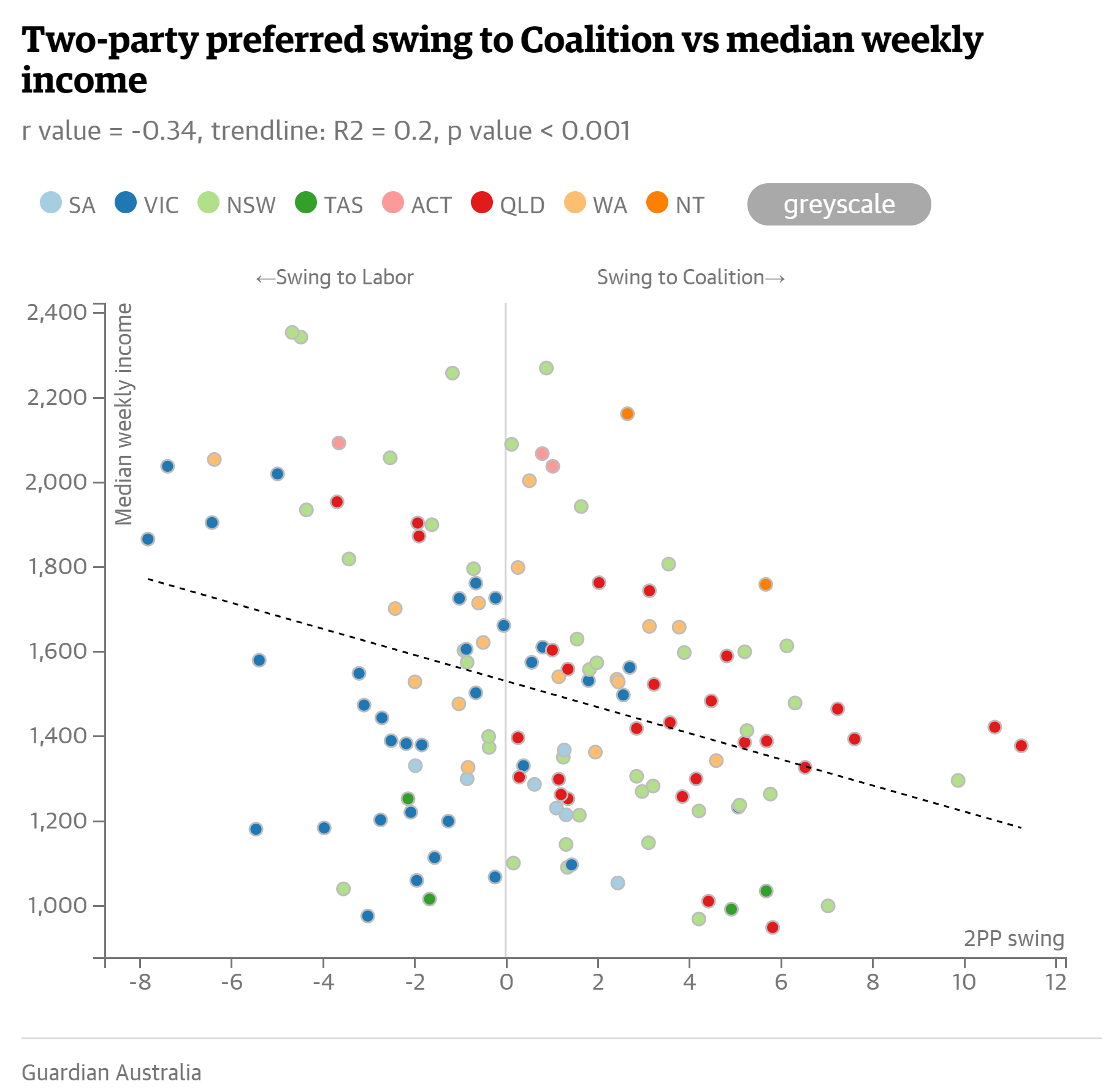
Figure 1: Two-party preferred swing to Coalition vs median weekly income.
Source: Evershed, 2019. The Guardian.
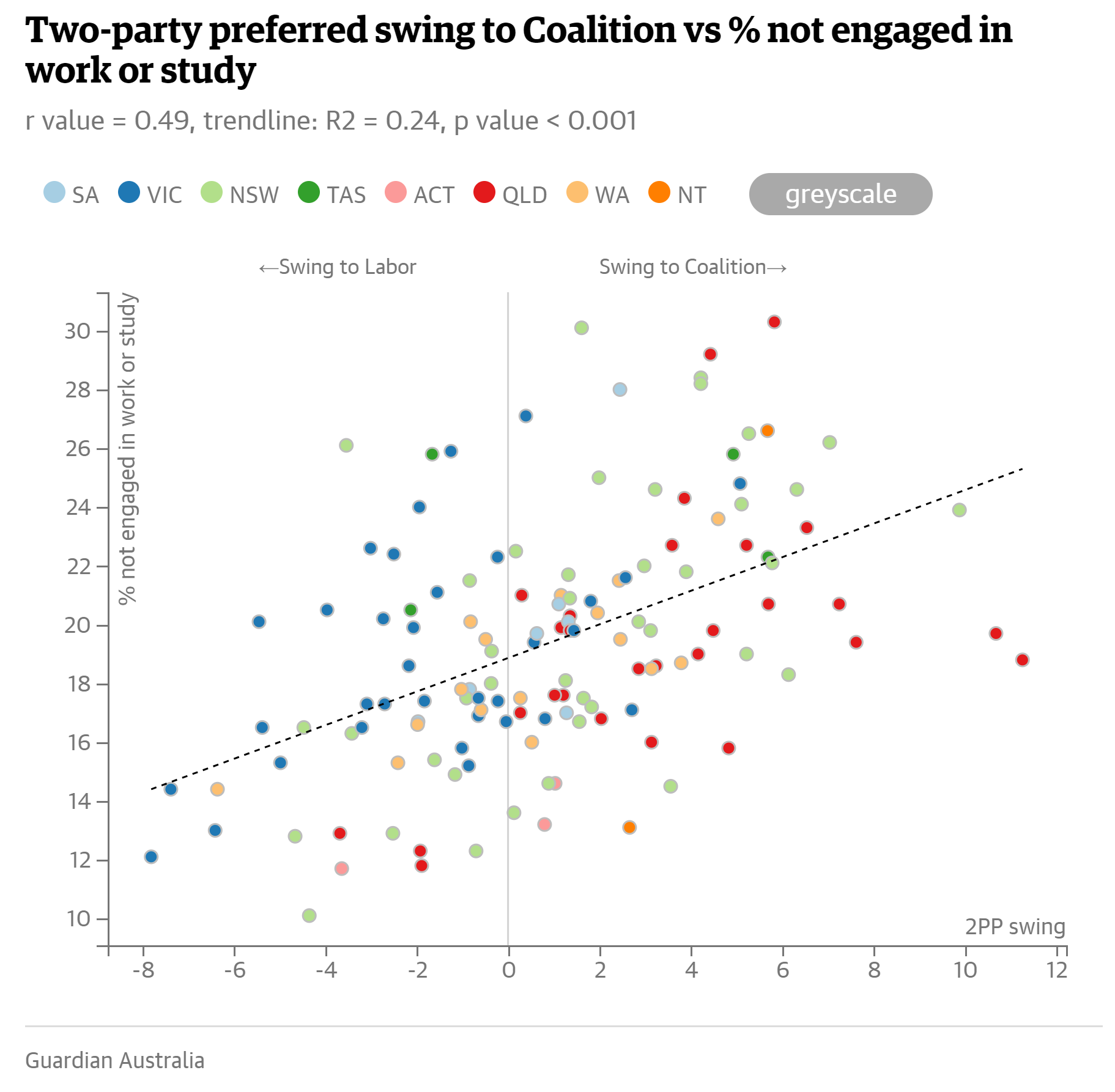
Figure 2: Two-party preferred swing to Coalition vs % not engaged in work or study
Source: Evershed, 2019. The Guardian.
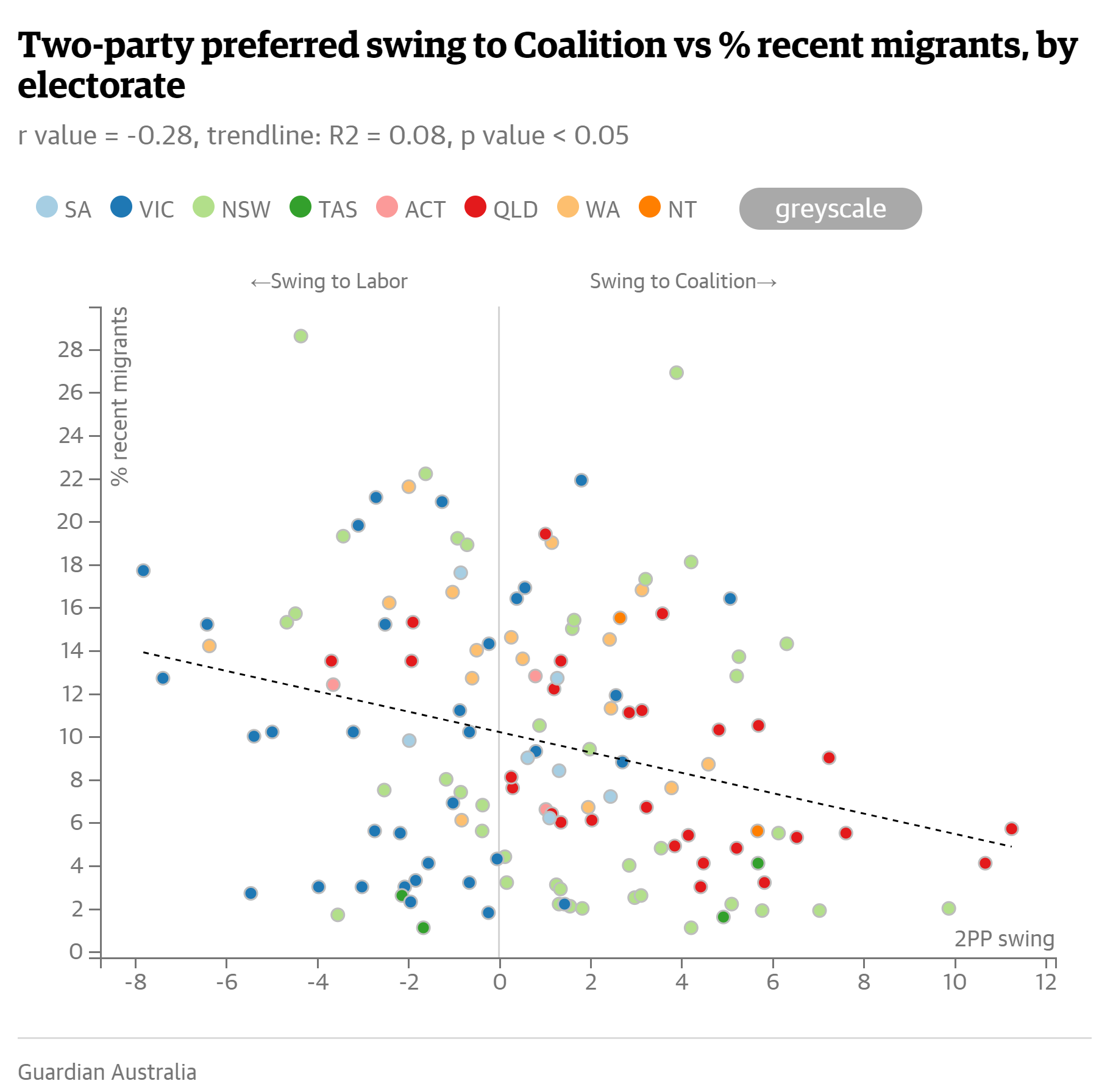
Figure 3: Two-party preferred swing to Coalition vs % recent migrants
Source: Evershed, 2019. The Guardian.
Exercise: What can we learn from The Guardian analysis? |
|
Read the full Guardian article. In groups of three discuss your answers to the following questions. Write your answers in the shared Google Doc.
|
Extension Exercise: How could you replicate this study? How could it be improved? |
|
If you finish the first exercise early, try to answer the following questions.
|
Review of Lesson 1.1 |
|
Quantitative analysis can be used to:
|
Further Reading |