0. How to I get my computer set up for today’s class?
# Install Packages
if(!require(dplyr)) {install.packages("sjlabelled", repos='https://cran.csiro.au/', dependencies=TRUE)}
if(!require(sjlabelled)) {install.packages("sjlabelled", repos='https://cran.csiro.au/', dependencies=TRUE)}
if(!require(sjmisc)) {install.packages("sjmisc", repos='https://cran.csiro.au/', dependencies=TRUE)}
if(!require(sjstats)) {install.packages("sjstats", repos='https://cran.csiro.au/', dependencies=TRUE)}
if(!require(sjPlot)) {install.packages("sjlabelled", repos='https://cran.csiro.au/', dependencies=TRUE)}
if(!require(summarytools)) {install.packages("summarytools", repos='https://cran.csiro.au/', dependencies=TRUE)}
if(!require(ggplot2)) {install.packages("ggplot2", repos='https://cran.csiro.au/', dependencies= TRUE)}
if(!require(ggthemes)) {install.packages("ggthemes", repos='https://cran.csiro.au/', dependencies= TRUE)}


# Load packages into memory
library(dplyr)
library(sjlabelled)
library(sjmisc)
library(sjstats)
library(sjPlot)
library(summarytools)
library(ggplot2)
library(ggthemes)

# Turn off scientific notation
options(digits=5, scipen=15)

# Stop View from overloading memory with a large datasets
RStudioView <- View
View <- function(x) {
  if ("data.frame" %in% class(x)) { RStudioView(x[1:500,]) } else { RStudioView(x) }
}

elect_2013 <- read.csv(url("https://methods101.com/data/elect_2013.csv"))
4. How do I make beautiful correlation matricies in R? sjPlot for beautiful tables and plots
The command I have taught you above - cor.test() - is fine for testing the relationship between just two variables. However, often you want to be able to look at the correlations between a large set of variables all the at the one time.
In addition, most journals expect you to produce a correlation matrix of all your variables - both so that the bivariate relationships between variables are clear to the reader, and as a prelude to conducting multivariate analysis.
Why we recommend ‘sj’ packages |
|
We (Hang Young Lee and myself) recommend using the various functions in ‘sj’ packages (sjlabelled, sjPlot, sjstats, sjmisc), combined with functionality from ggplot2, and also cascading style sheets (CSS), to do the formating of your publication quality tables and plots. The ‘sj’ packages have several important advantages over other approaches:
|
4.1 How to I make a correlation table (which I can paste into Excel, for example? sjt.corr() - correlation matrix as a HTML table
First we are going to learn how to make a HTML table of the correlation matrix.
What does it do?
- It makes a correlation matrix
- Sends it to your browser as a webpage
- From here you can either screenshot it, or cut and paste it into Excel for reformating.
The advantages of HTML tables are:
- They keep the output as text (not pixels/a picture), so you can actually change fonts, cut and paste into Excel, or move to another program.
- It is a nice simple black and white layout.
The disadvantages of HTML tables are:
- They are a little simple
- They don’t include all the amazing functionality of ggplots, such as colours and charts and shapes.
The command for correlation tables in sjPlots is sjt.corr(). Note that the only difference in the name of the command for tables and plots is that the plot command (below) is called sjp.corr(). But remember, the arguments (settings send to the function), and the output (HTML table vs picture) are completely different.
lga <- readRDS(url("https://www.methods101.com/data/nsw-lga-crime-clean.RDS"))
first <- which( colnames(lga)=="astdomviol" )
last <- which(colnames(lga)=="transport")
crimes <- lga[, first:last ]
sjt.corr(crimes, # the dataset
na.deletion = c("pairwise"), # pairwise deletion keeps more data than listwise
corr.method = c("pearson"), # pearsons r is the standard way to calculate correlation coefficients
title = NULL, # You can put a title for your table here
var.labels = NULL, # This is for variable lables if they aren't in your data already
wrap.labels = 100, # stops long variable labels wrapping
show.p = TRUE, # show's p-values as stars (*) or (**) or (***)
p.numeric = FALSE, # show's p-values as numbers
fade.ns = TRUE, # non-significant results appear in light grey
val.rm = NULL, #
digits = 2, # number of digits to round correlation coefficient
triangle = "both", # Above and below the diagonal in a matrix are the same. Do you want both?
string.diag = NULL, #
CSS = NULL, # This is for putting css code to make tables pretty
encoding = NULL, #
file = NULL, #
use.viewer = TRUE, # Sends output to browser
remove.spaces = TRUE) #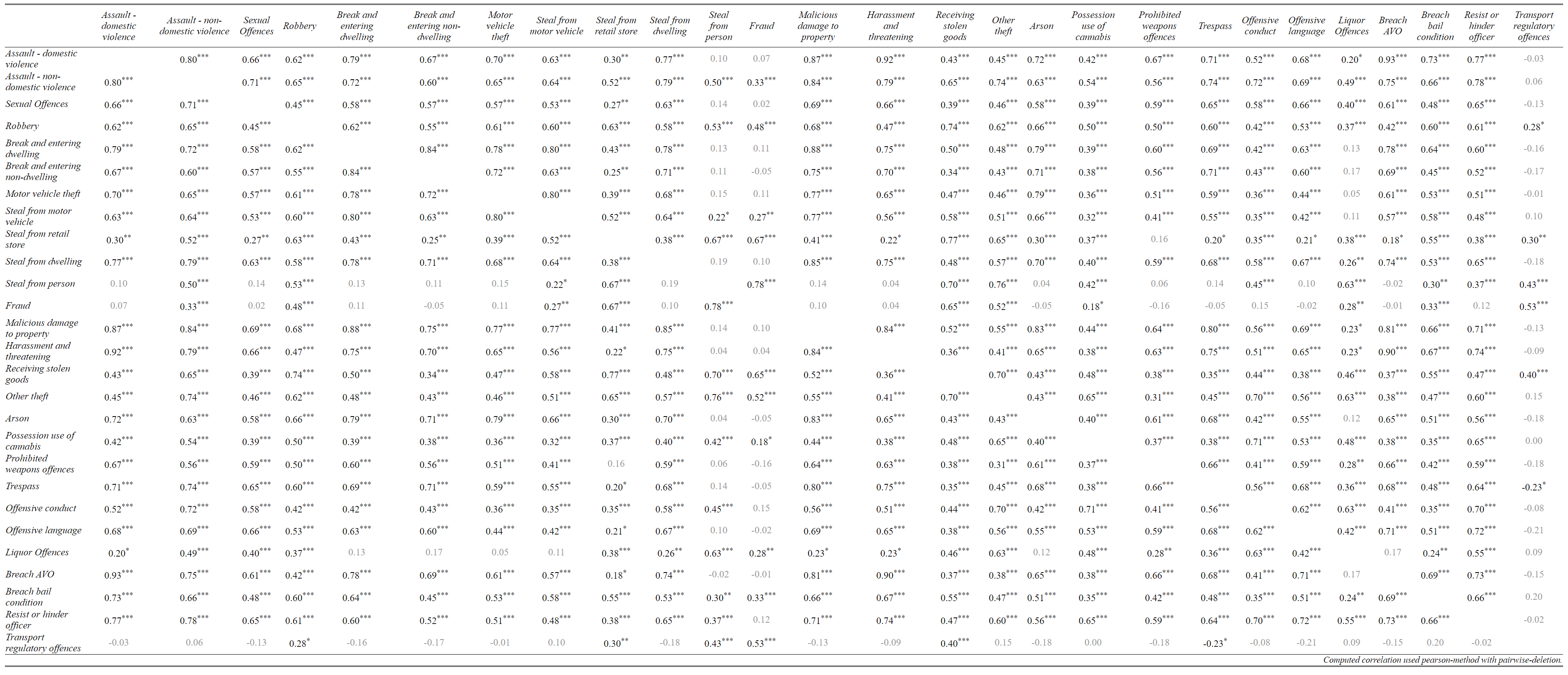
4.2 How do I make a colourful correlation plot/figure? sjp.corr() - correlation matrix as a figure/plot.
lga <- readRDS(url("https://www.methods101.com/data/nsw-lga-crime-clean.RDS"))
first <- which( colnames(lga)=="astdomviol" )
last <- which(colnames(lga)=="transport")
crimes <- lga[, first:last ]

sjp.corr(crimes,                # the dataset
  show.legend  = TRUE,          # shows the legend that appear on the right
  corr.method = "pearson",      # chooses pearsons r as the correlation method
  na.deletion = "pairwise",     # pairwise deletion, to save data
  sort.corr = FALSE             # if this was set to TRUE, it would sort so similar variables are
  )                             # next to each other. Makes it easier to spot patterns in data.
## Computing correlation using pearson-method with pairwise-deletion...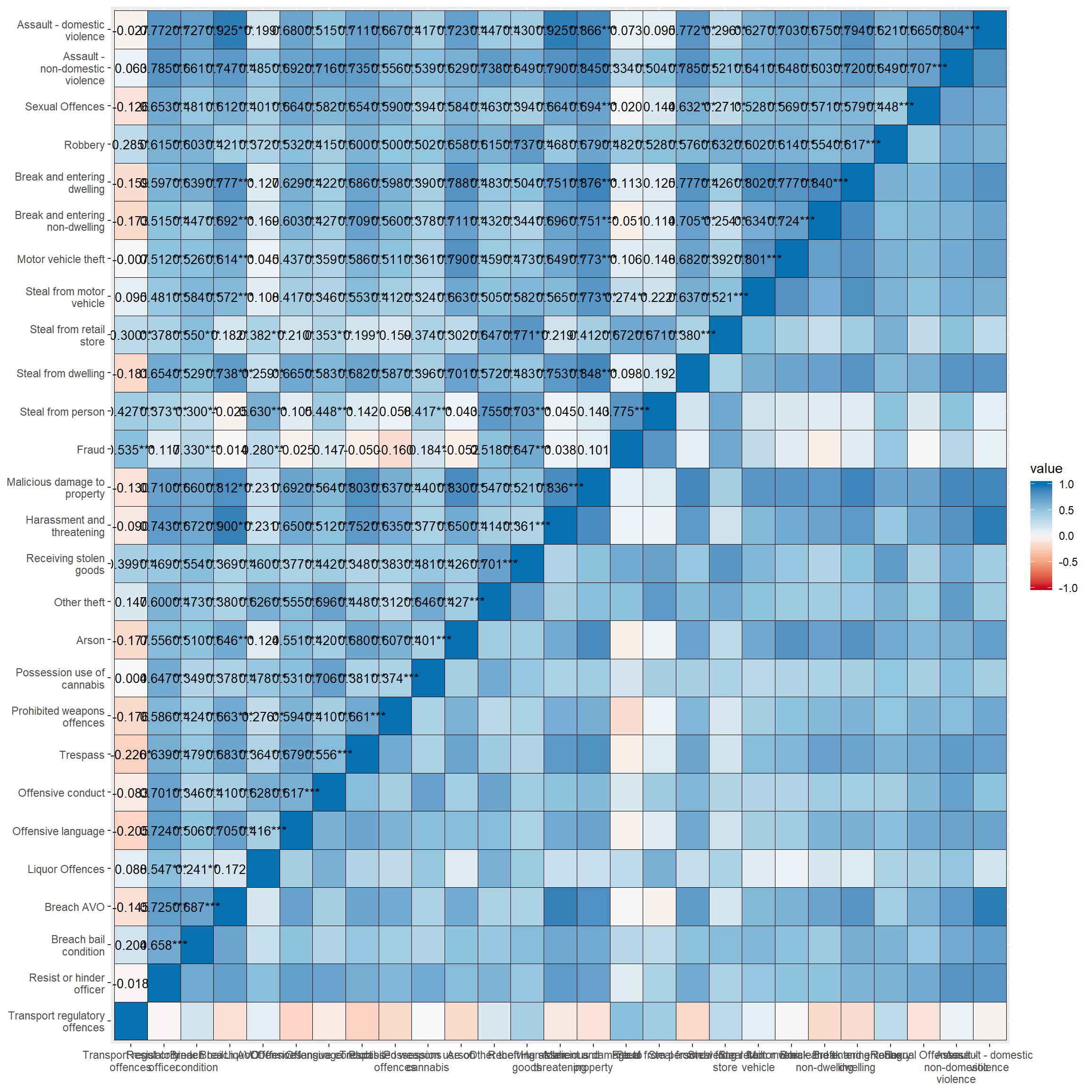
set_theme(                      # function in sjPlot to set various themes of tables
  base = theme_blank()          # this is a simple default theme, which makes text in cells
)                               # and labels the same size, and does a few other neat things.
sjp.corr(crimes,
decimals = 1, # sets number of decimals for correlations
wrap.labels =100, # stops variable labels wrapping
show.p=TRUE, # shows stars for p-values
show.values=TRUE, # shows correlation coefficients in figure
show.legend = TRUE, # shows the ledgent on the right hand side of figure
sort.corr = TRUE, # sorts the rows and columns by correlations
# - this makes it easier to see patterns
geom.colors = "RdBu", # colour scale for cells. This is Red-Blue.
corr.method = "pearson", # calculates pearson correlation. Default is spearman correlation.
na.deletion = "pairwise") + # uses pairwise deletion. Default is listwise deletion.
theme(axis.text.x=element_text(angle=90,
hjust=0.95,vjust=0.2)) + # rotates x-axis labels and aligns them to the right
labs(fill="Pearson's r") + # put a title on the legend
theme(legend.title = element_text(hjust = 0.5)) + # centres the legend title
guides(fill = guide_colourbar(ticks = FALSE,barwidth = 2, barheight = 15)) # removes the white ticks ## Computing correlation using pearson-method with pairwise-deletion...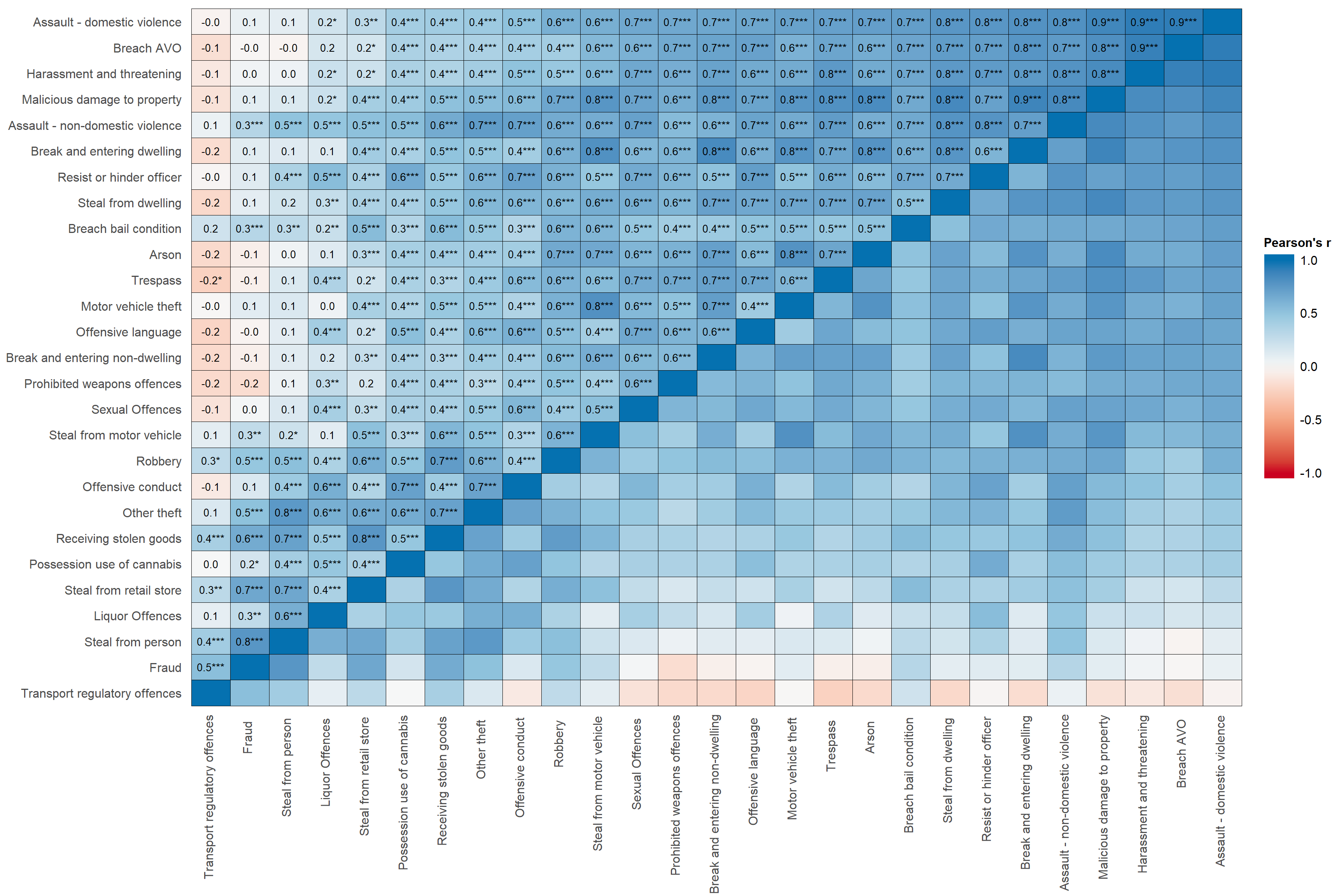
                                                                              # in the legend; also makes
                                                                              # colour bar wider and higher.
sjp.corr(crimes,
decimals = 1, # sets number of decimals for correlations
wrap.labels =100, # stops variable labels wrapping
show.p=TRUE, # shows stars for p-values
show.values=TRUE, # shows correlation coefficients in figure
show.legend = TRUE, # shows the ledgent on the right hand side of figure
sort.corr = TRUE, # sorts the rows and columns by correlations
# - this makes it easier to see patterns
geom.colors = "Spectral", # colour scale for cells. This is Spectral,
# which is Blue, green, yellow, orange, red.
corr.method = "pearson", # calculates pearson correlation. Default is spearman correlation.
na.deletion = "pairwise") + # uses pairwise deletion. Default is listwise deletion.
theme(axis.text.x=element_text(angle=90,
hjust=0.95,vjust=0.2)) + # rotates x-axis labels and aligns them to the right
labs(fill="Pearson's r") + # put a title on the legend
theme(legend.title = element_text(hjust = 0.5)) + # centres the legend title
guides(fill = guide_colourbar(ticks = FALSE,barwidth = 2, barheight = 15)) # removes the white ticks ## Computing correlation using pearson-method with pairwise-deletion...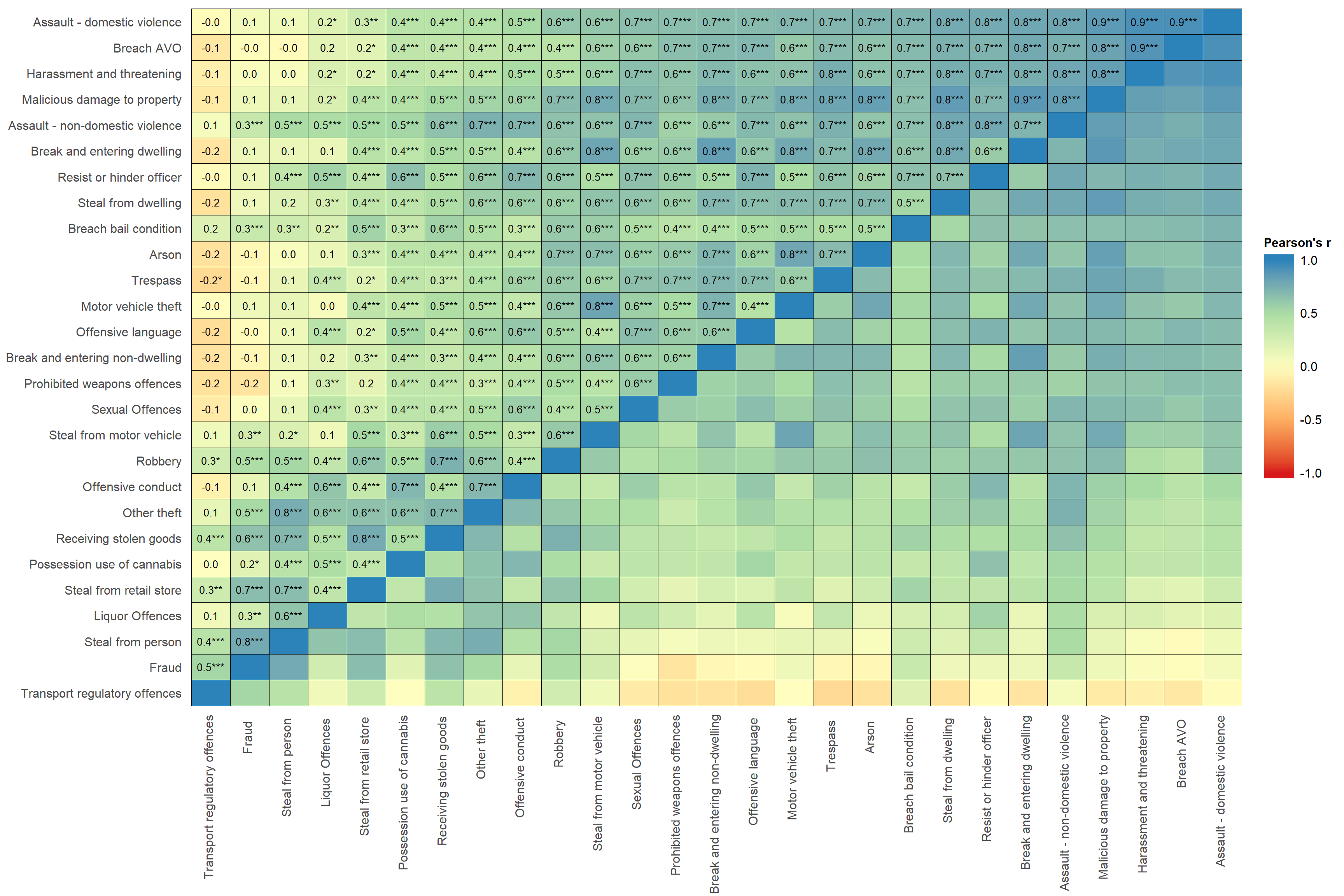
                                                                              # in the legend; also makes
                                                                              # colour bar wider and higher.