SummaryThe first thing you generally want to do with a quantitative data is check you haven’t made any major mistakes in entering to transforming the data. We do this by checking our descriptive statistics, and then looking at the histograms for each variable. |
SOCI2000 Workshop 1: Descriptive statistics
Step 1: Descriptive Statistics
While there are a large number of checks you could run, a good place to start is simply to generate the descriptive statistics.
By descriptive statistics, we generally mean the following statistics:
- the mean (average)
- the standard deviation (a measure of variation)
- the minimum
- the maximum
- the number of missing (or non-missing) cases
- In SPSS go to Analyze > Descriptive Statistics > Descriptives…

In the dialogue box that opens:
- Select all the variables in the box marked A in the diagram below. You can do this by clicking in the box, and then pressing “Control + A” (Windows) or “Apple + A” (Mac).
- Click the button with an arrow (marked 1 in the diagram below).
- Click the button “Options…”
- In the dialogue which opens (“Descriptives:Options”) select mean, Std deviation, Min, Max (these should be selected by default).
- Click “Continue”
- Click “OK”

- An output window will open with the descriptive statistics table in it (see image below).
This is how you read the table:
- N Statistic: This is the number of valid cases for this variable. Non-valid cases are mostly missing cases, such as people who didn’t answer that question.
What to look for? You want the number of valid cases to be a sensible number. Often there can be a problem where a zero is coded as missing. This is what seems to have happened for the variable is int_post, which has 1857 valid cases. This variable (look at the codebook) measures whether people have posted audio, video, or image files online. It has three values: NA = Missing; 0 = Unchecked; 1 = Checked. However, if we look the Minimum and Maximum values for this variable, the min and max are the same - one (1). This suggests there is no variation, and that all Unchecked values were coded as Missing. - Minimum Statistic & Maximum Statistic: This is the lowest value and highest of this variable.
What to look for? You want to check that these make sense. If you have someone who is 140 years old, there is probably a problem. If the youngest age is -999 then you also have a problem. - Mean Statistic: This is the mean of across all people in the dataset. You just want to ask if it is sensible.
- Std Deviation Statistic This is a measures of variability. We will discuss in more detail later.

Making Publishable Tables
If you are writing a report and you need to put these descriptive statistics into a report, then DO NOT just make a screenshot of the SPSS output.
Instead, what you should do is:
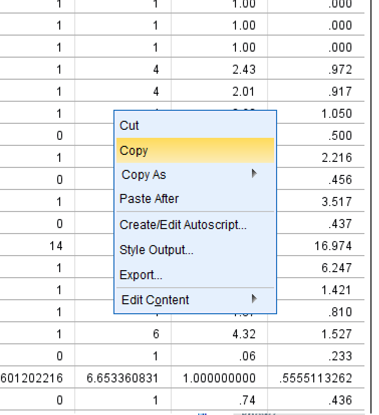
- right click on the table you want to copy, and select ‘copy’
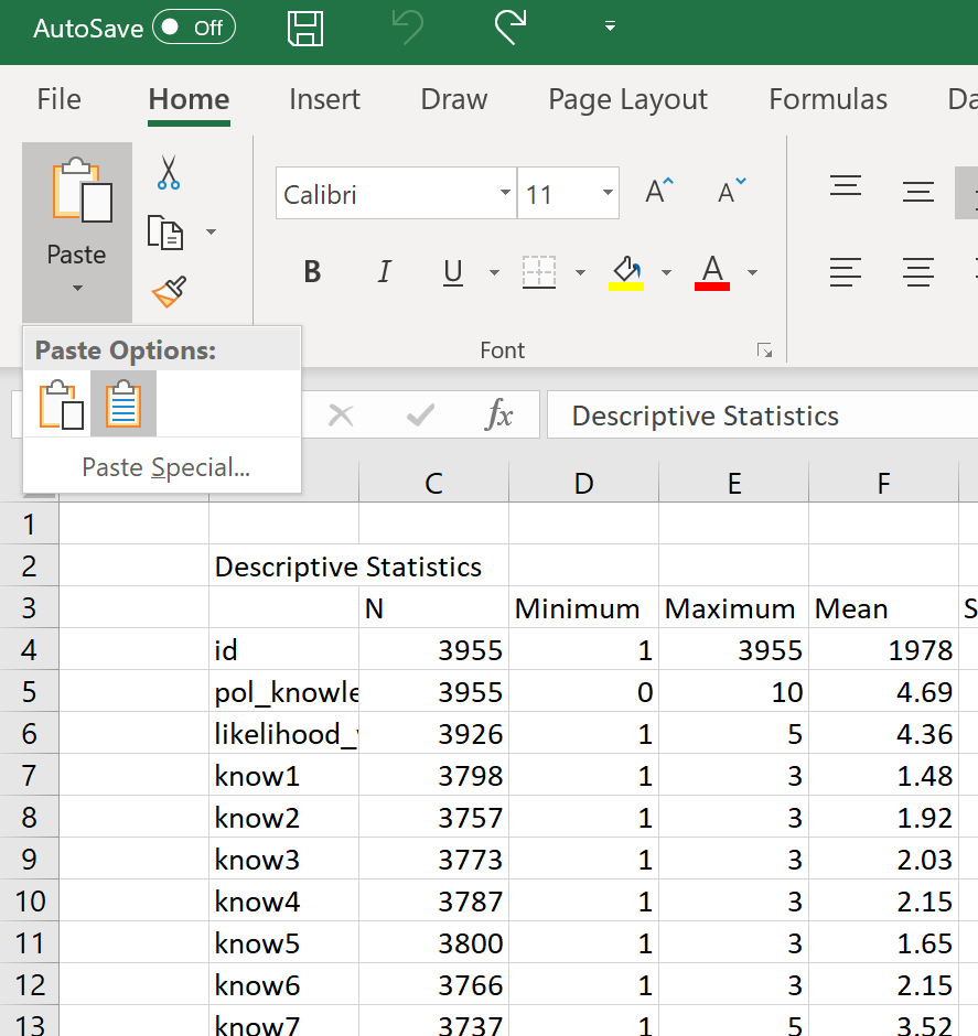
- open Excel, and then paste as text (this will strip out formating)
- In Excel, reduce all the decimal points to two decimal points, unless it is a number like 0.00001, which needs more decimal points
- put a vertical line at the top of the table, at the bottom of the table, and under the headings.
- Align the columns with numbers in them to the centre
- Turn off gridline (View>Gridlines)
- Take a screenshot of the table.

Step 2: Histograms
Another way to look for major mistakes in your dataset is to look at simple histograms of each variable.
A histogram is a graph of the frequency of different values of a variable.
Histograms group values into a small number of bins to make it easier to see a pattern.
- To create histograms go to Analyze > Descriptive Statistics > Frequencies…

- In the dialogue box that opens:
- Select all variables (Ctrl+A) in the left box, and click the arrow button to move them to the right.
- Click “Statistics”, and UNSELECT all the options, and click “Continue”.

- Click “Charts” and select “Histograms” and then “Continue”
- Click “OK”

- An output window will open, and in it you will see histograms for each of your variables.
The y-axis (Frequency) is the number of cases (persons) who have a particular value of the varaible.
For example, you can see that there are nearly 190 person who have an age of approximately 57-58.
What to look for? As with descriptive statistics, you are mainly just looking for things that don’t make sense, such as a large number of cases at some outlying value. What makes sense depends on the variable and the sample. For example, you can see below that age and political knowledge and likelihood vote have very different distributions, but all three of them make sense and seem reasonable.

