The sixth lab session covers the following:
- How to compute percentiles
- How to calculate descriptive statistics for sub-groups
- How to visualise the distribution for multiple variables and sub-groups
- How to include R outputs in your Word document
We will use five packages for this lab. Load them using the following code:
library(dplyr)
library(sjlabelled)
library(sjmisc)
library(sjPlot)
library(summarytools)
Import the 2012 AuSSa dataset.
This lab uses the 2012 AuSSa dataset. You can download this dataset in the course website(iLearn). Download the data file and put it into your working directory. Then, run the following code:
aus2012 <- readRDS("aussa2012.rds")The dataset is loaded as aus2012. Check the tab of Environment. You will see aus2012.
How to compute percentiles
A percentile is a statistical measure indicating that the value below which a given percentage of cases (or observations) falls. . ‘quantile(data name$variable name, c(pct1, pct2, pct3,…), na.rm = TRUE)’ computes the percentiles of variables of your choice. Percentile values (e.g., pct1, pct2) should be entered as proportions. For example, when you want to calculate the 10th percentile, you should input .10. ‘na.rm = TRUE’ excludes cases with missing values (NA) in calculating the percentile. The following code computes 10th, 25th, 50th, 75th and 90th percentile of age in aus2012.
quantile(aus2012$age, c(.10, .25, .50, .75, .90), na.rm = TRUE)## 10% 25% 50% 75% 90%
## 29 41 54 65 73How to calculate descriptive statistics for sub-groups
In lab 5 I showed how to compute descriptive statistics for all respondents. However, we sometimes need to calculate them for sub-groups such as only male or female respondents. This kind of analysis is called sub-group analysis. This section focuses on how to conduct this sub-group analysis.
Creating a dataset of a sub-group
We will make a new dataset called aus2012.m which includes only male respondents. Run the following code:
aus2012.m <- aus2012 %>%
  filter(sex == 1)
frq(aus2012.m$sex)
##
## Sex of Respondent (x) <numeric>
## # total N=699 valid N=699 mean=1.00 sd=0.00
##
## Value | Label | N | Raw % | Valid % | Cum. %
## -----------------------------------------------
## 1 | Male | 699 | 100 | 100 | 100
## 2 | Female | 0 | 0 | 0 | 100
## <NA> | <NA> | 0 | 0 | <NA> | <NA>The first line assigns a new dataset name before the arrow (<-) and the name of the dataset from which the new dataset is extracted after the arrow. The second line specifies selection criteria. Use ‘filter(selection criteria)’. In this case, we select cases in which respondents are males (sex == 1). Note that we use two equal signs (==), which is a logical operator meaning “exactly equal to”. Table 1 shows logical operators.
The third line generates a frequency table of gender for the new dataset. As expected, it only includes male respondents.
The following code creates a dataset which includes only female respondents.
aus2012.f <- aus2012 %>%
  filter(sex == 2)
frq(aus2012.f$sex)
##
## Sex of Respondent (x) <numeric>
## # total N=876 valid N=876 mean=2.00 sd=0.00
##
## Value | Label | N | Raw % | Valid % | Cum. %
## -----------------------------------------------
## 1 | Male | 0 | 0 | 0 | 0
## 2 | Female | 876 | 100 | 100 | 100
## <NA> | <NA> | 0 | 0 | <NA> | <NA>When you select cases, you can specify multiple criteria. For example, the following code generates a dataset which includes male respondents who live in NSW (region == 1).
aus2012.m.nsw <- aus2012 %>%
  filter(sex == 1, region == 1)
frq(aus2012.m.nsw$sex)
##
## Sex of Respondent (x) <numeric>
## # total N=211 valid N=211 mean=1.00 sd=0.00
##
## Value | Label | N | Raw % | Valid % | Cum. %
## -----------------------------------------------
## 1 | Male | 211 | 100 | 100 | 100
## 2 | Female | 0 | 0 | 0 | 100
## <NA> | <NA> | 0 | 0 | <NA> | <NA>frq(aus2012.m.nsw$region)##
## Country specific region: Australia (x) <numeric>
## # total N=211 valid N=211 mean=1.00 sd=0.00
##
## Value | Label | N | Raw % | Valid % | Cum. %
## ---------------------------------------------------------------------
## 1 | New South Wales | 211 | 100 | 100 | 100
## 2 | Victoria | 0 | 0 | 0 | 100
## 3 | Queensland | 0 | 0 | 0 | 100
## 4 | South Australia | 0 | 0 | 0 | 100
## 5 | Western Australia | 0 | 0 | 0 | 100
## 6 | Tasmania | 0 | 0 | 0 | 100
## 7 | Australian Capital Territory | 0 | 0 | 0 | 100
## 8 | Northern Territory | 0 | 0 | 0 | 100
## <NA> | <NA> | 0 | 0 | <NA> | <NA>Creating a dataset of specific variables
This time we will make a dataset which includes only variables of your choice. Suppose that we want to make a dataset which includes only variables measuring attitudes toward working mom in the 2012 AuSSa. The following code will do this job.
aus2012.working.mom <- aus2012 %>%
  select("fechld", "fepresch", "famsuffr", "homekid", "housewrk")
aus2012.working.mom
## # A tibble: 1,612 x 5
## fechld fepresch famsuffr homekid housewrk
## <dbl> <dbl> <dbl> <dbl> <dbl>
## 1 5 1 3 3 3
## 2 1 5 5 5 1
## 3 2 4 2 5 2
## 4 2 4 4 2 3
## 5 1 4 4 4 4
## 6 NA NA NA NA NA
## 7 2 4 4 4 2
## 8 4 3 2 5 4
## 9 2 4 4 4 4
## 10 2 3 2 5 1
## # ... with 1,602 more rowsThere is only one difference in this code from what you used for selecting cases. ‘select(var1, var2, var3, …)’ is the function for choosing variables of your choice. The third line shows the newly created dataset.
Frequency tables for sub-groups
Based on the codes you have learned so far, let us make a frequency table of fechld for only male respondents. The following code will do this job.
aus2012 %>%
  filter(sex == 1) %>%
  select(fechld) %>%
  frq()
##
## Q1a Working mom: warm relationship with children as a not working mom (fechld) <numeric>
## # total N=699 valid N=683 mean=2.62 sd=1.14
##
## Value | Label | N | Raw % | Valid % | Cum. %
## -------------------------------------------------------------------
## 1 | Strongly agree | 89 | 12.73 | 13.03 | 13.03
## 2 | Agree | 313 | 44.78 | 45.83 | 58.86
## 3 | Neither agree nor disagree | 86 | 12.30 | 12.59 | 71.45
## 4 | Disagree | 157 | 22.46 | 22.99 | 94.44
## 5 | Strongly disagree | 38 | 5.44 | 5.56 | 100.00
## <NA> | <NA> | 16 | 2.29 | <NA> | <NA>What this code does is 1) to use the aus2012 dataset, and then (%>%) 2) to select cases where respondents are males, and then 3) to choose the fechld variable, and then 4) to make a frequency table.
When you want to use ‘freq()’ instead of ‘frq()’ for making frequency tables, a different approach should be used since the summarytools package does not support labelled datasets. We need to use the dataset of male respondents that we created in the previous section. The code is:
freq(to_label(aus2012.m$fechld))## Frequencies
##
## Freq % Valid % Valid Cum. % Total % Total Cum.
## -------------------------------- ------ --------- -------------- --------- --------------
## Strongly agree 89 13.03 13.03 12.73 12.73
## Agree 313 45.83 58.86 44.78 57.51
## Neither agree nor disagree 86 12.59 71.45 12.30 69.81
## Disagree 157 22.99 94.44 22.46 92.27
## Strongly disagree 38 5.56 100.00 5.44 97.71
## <NA> 16 2.29 100.00
## Total 699 100.00 100.00 100.00 100.00The following code generates a frequency table of fechld for female respondents.
aus2012 %>%
  filter(sex == 2) %>%
  select(fechld) %>%
  frq()
##
## Q1a Working mom: warm relationship with children as a not working mom (fechld) <numeric>
## # total N=876 valid N=852 mean=2.11 sd=1.05
##
## Value | Label | N | Raw % | Valid % | Cum. %
## -------------------------------------------------------------------
## 1 | Strongly agree | 260 | 29.68 | 30.52 | 30.52
## 2 | Agree | 387 | 44.18 | 45.42 | 75.94
## 3 | Neither agree nor disagree | 77 | 8.79 | 9.04 | 84.98
## 4 | Disagree | 107 | 12.21 | 12.56 | 97.54
## 5 | Strongly disagree | 21 | 2.40 | 2.46 | 100.00
## <NA> | <NA> | 24 | 2.74 | <NA> | <NA>freq(to_label(aus2012.f$fechld))## Frequencies
##
## Freq % Valid % Valid Cum. % Total % Total Cum.
## -------------------------------- ------ --------- -------------- --------- --------------
## Strongly agree 260 30.52 30.52 29.68 29.68
## Agree 387 45.42 75.94 44.18 73.86
## Neither agree nor disagree 77 9.04 84.98 8.79 82.65
## Disagree 107 12.56 97.54 12.21 94.86
## Strongly disagree 21 2.46 100.00 2.40 97.26
## <NA> 24 2.74 100.00
## Total 876 100.00 100.00 100.00 100.00Descriptive statiscs for sub-groups
The code for calculating descriptive statistics for sub-groups is similar to that for frequency tables. The only difference is to use ‘descr()’ instead of ‘frq()’. The following code computes descriptive statistics of age for male and female respondents, respectively.
aus2012 %>%
  filter(sex == 1) %>%
  select(age) %>%
  descr()
## Descriptive Statistics
## aus2012$age
## N: 699
##
## age
## ----------------- --------
## Mean 55.22
## Std.Dev 16.30
## Min 18.00
## Q1 44.00
## Median 57.00
## Q3 66.00
## Max 93.00
## MAD 16.31
## IQR 22.00
## CV 0.30
## Skewness -0.24
## SE.Skewness 0.09
## Kurtosis -0.44
## N.Valid 691.00
## Pct.Valid 98.86aus2012 %>%
filter(sex == 2) %>%
select(age) %>%
descr()## Descriptive Statistics
## aus2012$age
## N: 876
##
## age
## ----------------- --------
## Mean 51.13
## Std.Dev 16.23
## Min 18.00
## Q1 39.00
## Median 52.00
## Q3 64.00
## Max 91.00
## MAD 17.79
## IQR 24.75
## CV 0.32
## Skewness -0.05
## SE.Skewness 0.08
## Kurtosis -0.68
## N.Valid 866.00
## Pct.Valid 98.86How to visualise the distributions for multiple variables and sub-groups
In lab 5 we learned how to visualise the distribution of one variable. Building on this knowledge, this lab introduces how to visualise the distribution for multiple variables and sub-groups.
Note
When you try to visualise variables, you might see a warning message saying “Package ‘snakecase’ needs to be installed for case-conversion”. To fix this problem, run the following code.
install.packages("snakecase")Or you may see a warning message saying “Package ‘ggrepel’ needed to plot labels. Please install it.” In this case run the following code.
install.packages("ggrepel")Or you may see a warning message saying “there is no pacakge called ‘quantreg’”. In this case run the following code.
install.packages("quantreg")Then, restart RStudio, load all the packages again and make a graph again.
Stacked bar graphs for multiple variables
Suppose that we want to visualise all the variables of attitudes toward working moms so that we can easily compare the distributions. For doing this, we need to create a dataset consisting of all the variables we want to visualise. We already made this dataset in the previous section, which is aus2012.working.mom. The following code visualises all the five variables of attitudes toward working moms.
plot_stackfrq(aus2012.working.mom,
title = "Attitude toward working mom") 
If you want to flip coordinates of stacked bar graphs, add coord.flip = FALSE to the option. In the following code, I also add ‘wrap.labels = 20’ to avoid the overlap between labels.
plot_stackfrq(aus2012.working.mom,
title = "Attitude toward working mom",
wrap.labels = 20, coord.flip = FALSE) 
Stacked bar graphs for multiple Likert scales
‘plot_likert()’ is a function specifically designed for visualising Likert scales. Since all the variables of attitudes toward working moms use Likert scales, it would be better to visualise them using this function. The code is:
plot_likert(aus2012.working.mom,
cat.neutral = 3, title = "Attitude toward working mom") 
You may notice that the neutral category (Neither agree nor disagree) is separated from other categories because it is not our primary focus. Thus, you always need to tell which is a neutral category using ‘cat.neutral’ option.
Bar graphs between groups
This time we visualise the distribution of one variable but do it by different groups. Suppose that we want to compare the distribution of fechld between men and women. plot_xtab(grouping variable, the name of variable to be compared, bar.pos = “dodge”) make this job easier. The following code shows the bar graph of fechld by sex.
plot_xtab(aus2012$sex, aus2012$fechld, bar.pos = "dodge", show.total = FALSE,
margin = "row", coord.flip = FALSE, show.n = FALSE)
The margin option sets how percentages are calculated. ‘margin = “row”’ computes the percentages of responses within each group (in this case, each gender category).
In the above code, replace bar.pos = "dodge" with bar.pos = "stack". It will make a stacked bar graph between groups. The stacked bar graph between groups makes it easier to compare the percentage of each response between groups. Also, coord.flip = TRUE is used to flip coordinates of the stacked bar graph in order to make the comparison much easier.
plot_xtab(aus2012$sex, aus2012$fechld, bar.pos = "stack", show.total = FALSE,
margin = "row", coord.flip = TRUE, show.n = FALSE)
Simple boxplots
When you want to make a boxplot of one variable, use ‘plot_frq(data name$variable name, type = “box”)’. The following code makes a boxplot of age in the aus2012 dataset.
plot_frq(aus2012$age, type = "box", axis.title = "Respondent's Age")
Note
You may see a warning message saying “fun.y is deprecated. Use fun instead”. However, this message will not affect your figure. Please ignore it.
Grouped boxplots
When you want to make the boxplot of one variable by different groups, use ‘plot_grpfrq(the name of variable to be compared, grouping variable, type = “box”)’. The following code creates the boxplots of age by sex.
plot_grpfrq(aus2012$age, aus2012$sex, type = "box",
axis.title = "Respondent's Age", ylim = c(0, 100))
‘ylim = c(minimum value, maximum value)’ sets the range of y-axis. As instructed, the y-axis ranges from 0 to 100.
Histograms for different groups
There is no simple code to generate the histograms of one variable by groups. Thus, we need to create datasets for each group and use them for visualisation. Suppose that we want to plot the histogram of age for male and female respondents, respectively. We use aus2012.m which includes only males and aus2012.f which includes only females that we constructed in the previous section. The following code generates these two histograms.
plot_frq(aus2012.m$age, type = "hist", title = "Distribution of Age for Males",
axis.title = "Age", grid.breaks = 10)
plot_frq(aus2012.f$age, type = "hist", title = "Distribution of Age for Females",
axis.title = "Age", grid.breaks = 10)
How to include R outputs in your document
The lab assignment requires you to include relevant R outputs in your documents. This section introduces how to include them in an MS Word document.
How to include R outputs from the window of Console
When you want to include R outputs from the window of Console (e.g., frequency tables, descriptive statistics), select the output you want to include and then right-click. You will see the copy option. Choose it (See Figure 1).
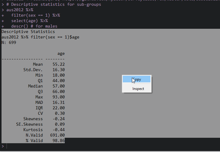
Figure 1: Copy from R Console
If you use Window,
Open MS Word and right-click. In the paste option, choose “Keep Source Formatting”.
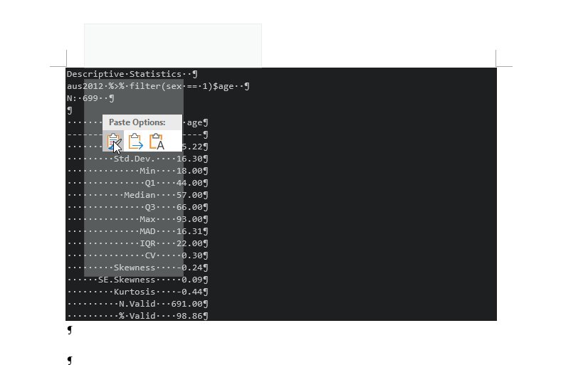
Figure 2: Import R Outputs into MS Word
If you use Mac,
Open MS Word and right-click. Choose “Paste”.
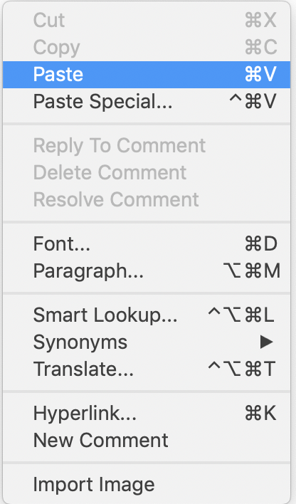
Figure 3: Import R Outputs into MS Word on Mac (1)
Then, select the copied R outputs. Choose a fixed-width font such as ‘Courier New’. If you want, decrease the size of fonts (optional). Set 1.0 for line spacing.
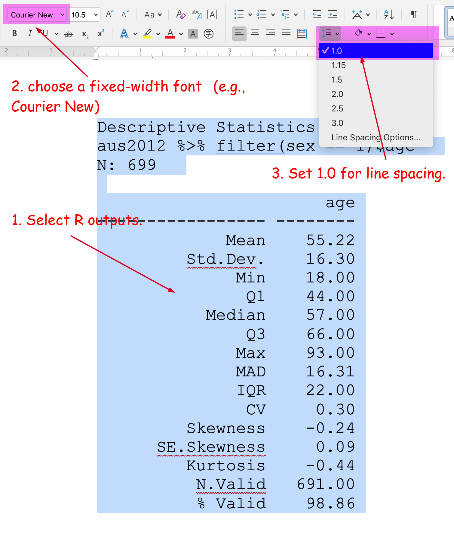
Figure 4: Import R Outputs into MS Word on Mac (2)
How to include R graphs from the window of Plots
When you want to include R outputs from the window of Plots (all kinds of graphs), click Export at the top of the Plots window and choose “Copy to Clipboard” (See Figure 3).
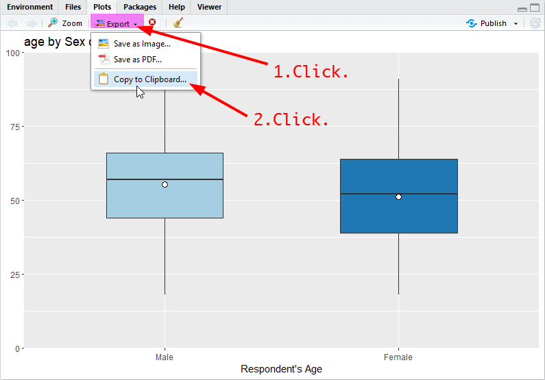
Figure 5: Copy from R Plots
In a popped-up window, click “Copy Plot” at the bottom. If you do not like the size of graphs, you can change it either by 1) specifying the width and height at the top (then click “Update Preview”) or 2) moving the bottom-right triangle while pressing down the right button of the mouse (See Figure 4).
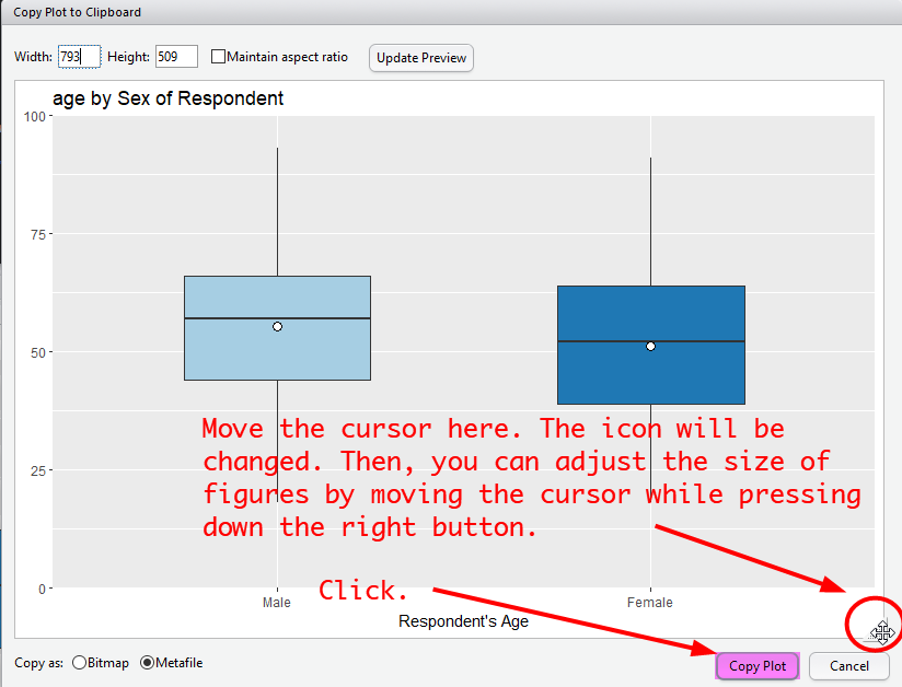
Figure 6: Import R Graphs into MS Word
Then, paste the graph into a MS Word document.
Lab 6 Participation Activity |
|
No Lab Participation Activity this week. Completing R Analysis Task 1 will contribute to your participation mark. |
The R codes you have written so far look like:
################################################################################
# Lab 6: Univariate Analysis 2 & Normal Distribution
# 19/04/2021
# SOCI8015 & SOCX8015
################################################################################
# Load packages
library(dplyr)
library(sjlabelled)
library(sjmisc)
library(sjPlot)
library(summarytools)
# Import the 2012 AuSSa dataset.
aus2012 <-readRDS("aussa2012.rds")
# How to compute percentiles
quantile(aus2012$age, c(.10, .25, .50, .75, .90), na.rm = TRUE)
# Creating a dataset of a sub-group
aus2012.m <- aus2012 %>%
filter(sex == 1)
frq(aus2012.m$sex)
aus2012.f <- aus2012 %>%
filter(sex == 2)
frq(aus2012.f$sex)
aus2012.m.nsw <- aus2012 %>%
filter(sex == 1, region == 1)
frq(aus2012.m.nsw$sex)
frq(aus2012.m.nsw$region)
# Creating a dataset of specific variables
aus2012.working.mom <- aus2012 %>%
select("fechld", "fepresch", "famsuffr", "homekid", "housewrk")
aus2012.working.mom
# Frequency tables for sub-groups
aus2012 %>%
filter(sex == 1) %>%
select(fechld) %>%
frq() # for males
freq(to_label(aus2012.m$fechld))
aus2012 %>%
filter(sex == 2) %>%
select(fechld) %>%
frq()
freq(to_label(aus2012.f$fechld))
# Descriptive statistics for sub-groups
aus2012 %>%
filter(sex == 1) %>%
select(age) %>%
descr() # for males
aus2012 %>%
  filter(sex == 2) %>%
  select(age) %>%
descr() # for females
# Stacked bar graphs for multiple variables
plot_stackfrq(aus2012.working.mom,
             title = "Attitude toward working mom")
plot_stackfrq(aus2012.working.mom,
             title = "Attitude toward working mom",
             wrap.labels = 20, coord.flip = FALSE)
# Stacked bar graphs for likert scale
plot_likert(aus2012.working.mom,
           cat.neutral = 3, title = "Attitude toward working mom")
# Bar graphs between groups
plot_xtab(aus2012$sex, aus2012$fechld, bar.pos = "dodge", show.total = FALSE,
          margin = "row", coord.flip = FALSE, show.n = FALSE)
plot_xtab(aus2012$sex, aus2012$fechld, bar.pos = "stack", show.total = FALSE,
          margin = "row", coord.flip = TRUE, show.n = FALSE)
# Simple boxplots
plot_frq(aus2012$age, type = "box", axis.title = "Respondent's Age")
# Grouped boxplots
plot_grpfrq(aus2012$age, aus2012$sex, type = "box",
           axis.title = "Respondent's Age",  ylim = c(0, 100))
# Histograms for different groups
plot_frq(aus2012.m$age, type = "hist", title = "Distribution of Age for Males",
  axis.title = "Age", grid.breaks = 10)
plot_frq(aus2012.f$age, type = "hist", title = "Distribution of Age for Females",
  axis.title = "Age", grid.breaks = 10)